LG2
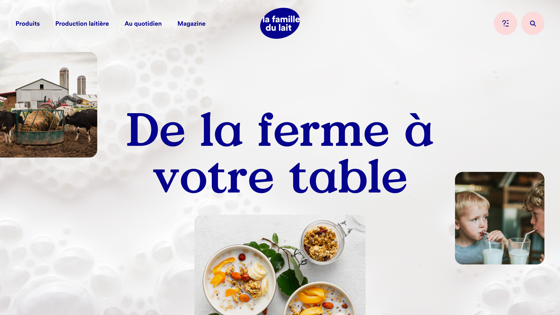
A consumer-centric experience of local dairy
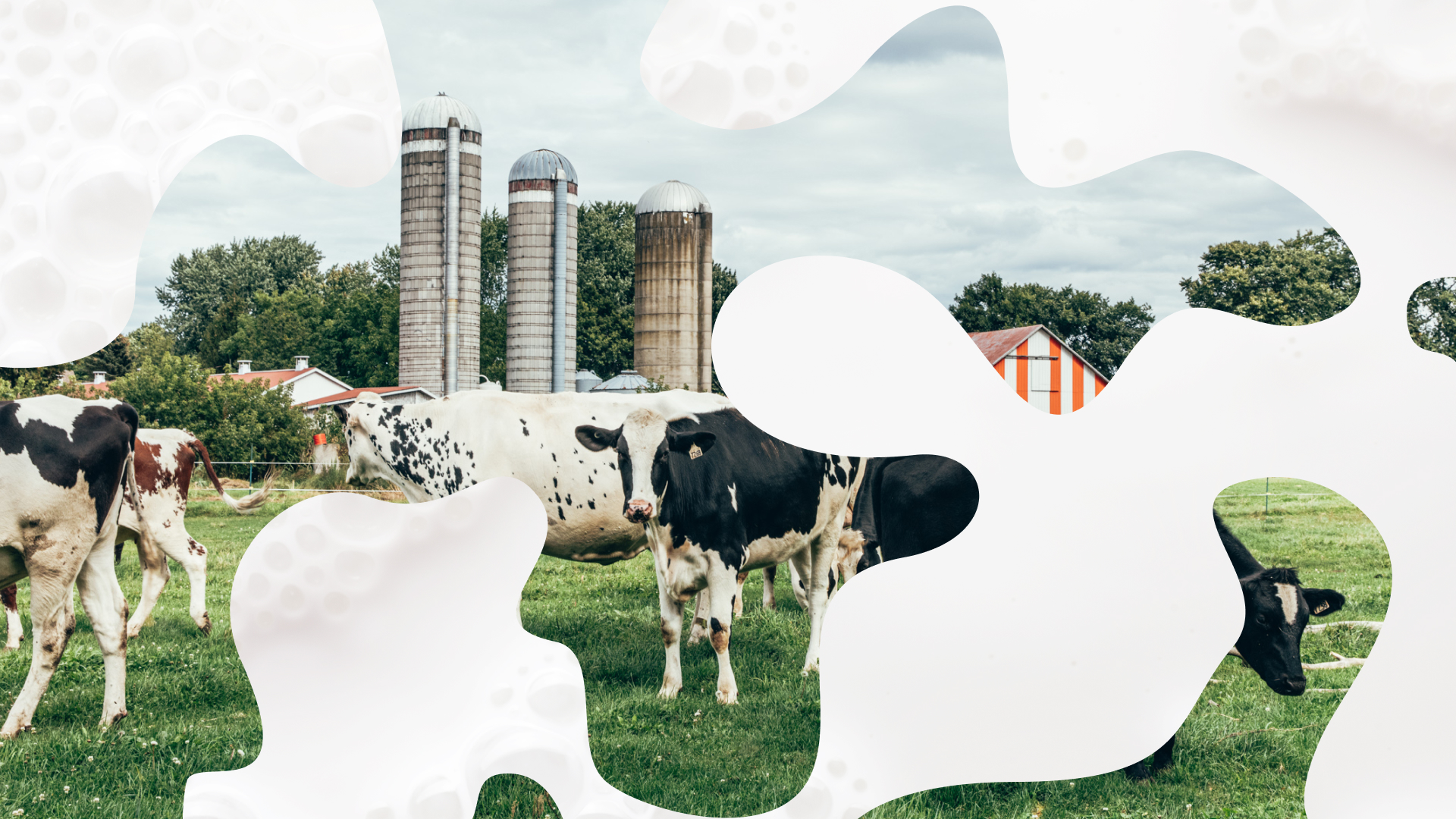
Milk glasses full of facts
A consumer-centric experience of local dairy
Milk glasses full of facts
Government & Associations /
Nominee
We migrated 300 pages from the previous site and reorganized them in a much more digestible way.Joël Auchu, Exécutive Creative Director, Digital Experience, LG2
Q: Once you settled on your idea, what influenced your decision on the chosen technical approach? How did it differ or go beyond approaches you’ve taken in the past?
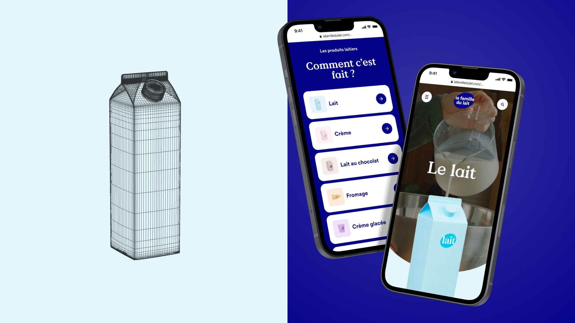
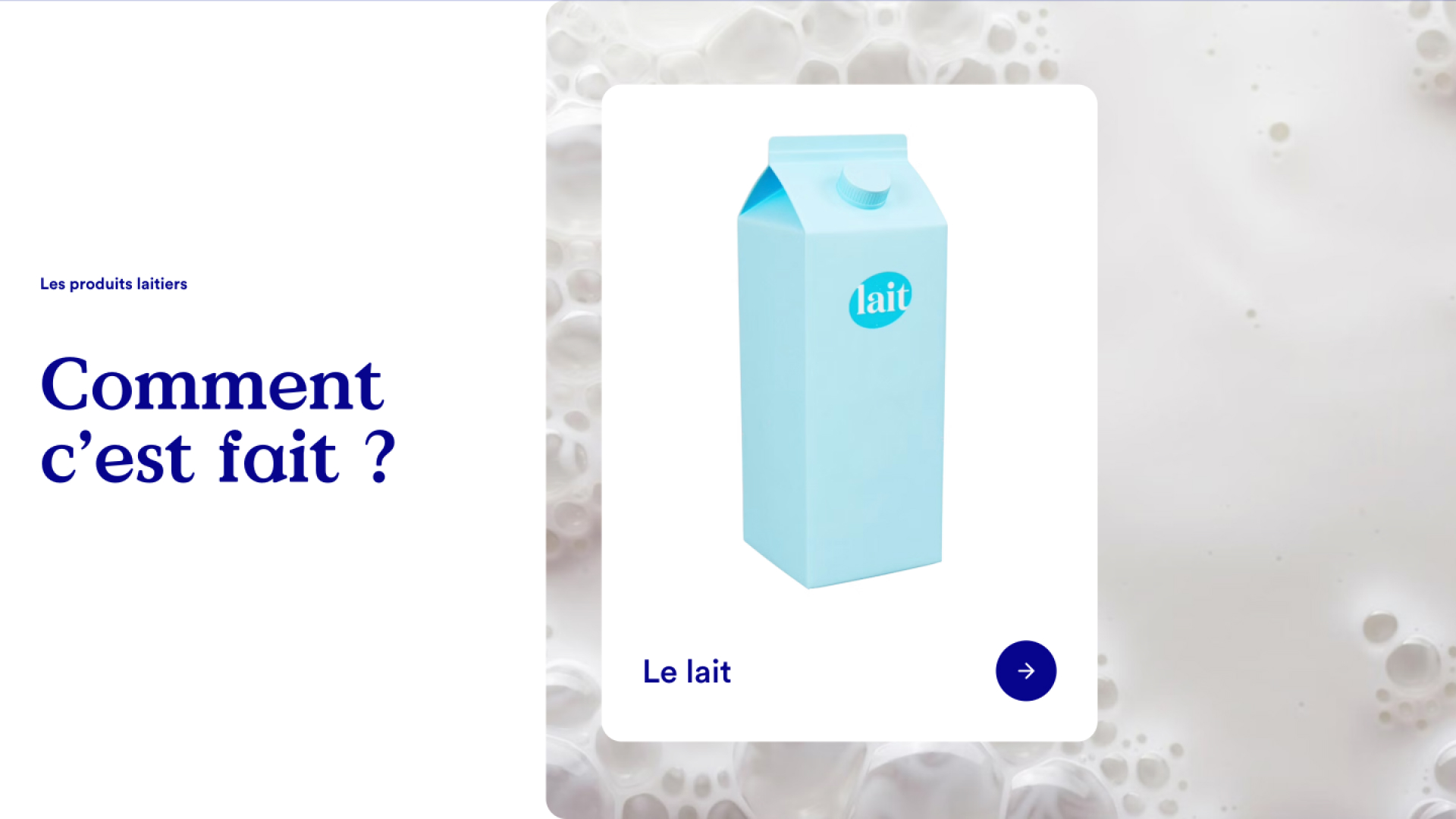
A: We aimed to build an interactive website that could offer an excellent browsing experience without being too immersive, in order to keep users focused on the content. We chose smooth transitions and subtle rollovers that align with the brand’s art direction, which helps content graphic designers. Likewise, we mostly favored lightweight solutions for transitions, using Canvas 2D, short video loops, sprite sheets scrolling and animated SVG.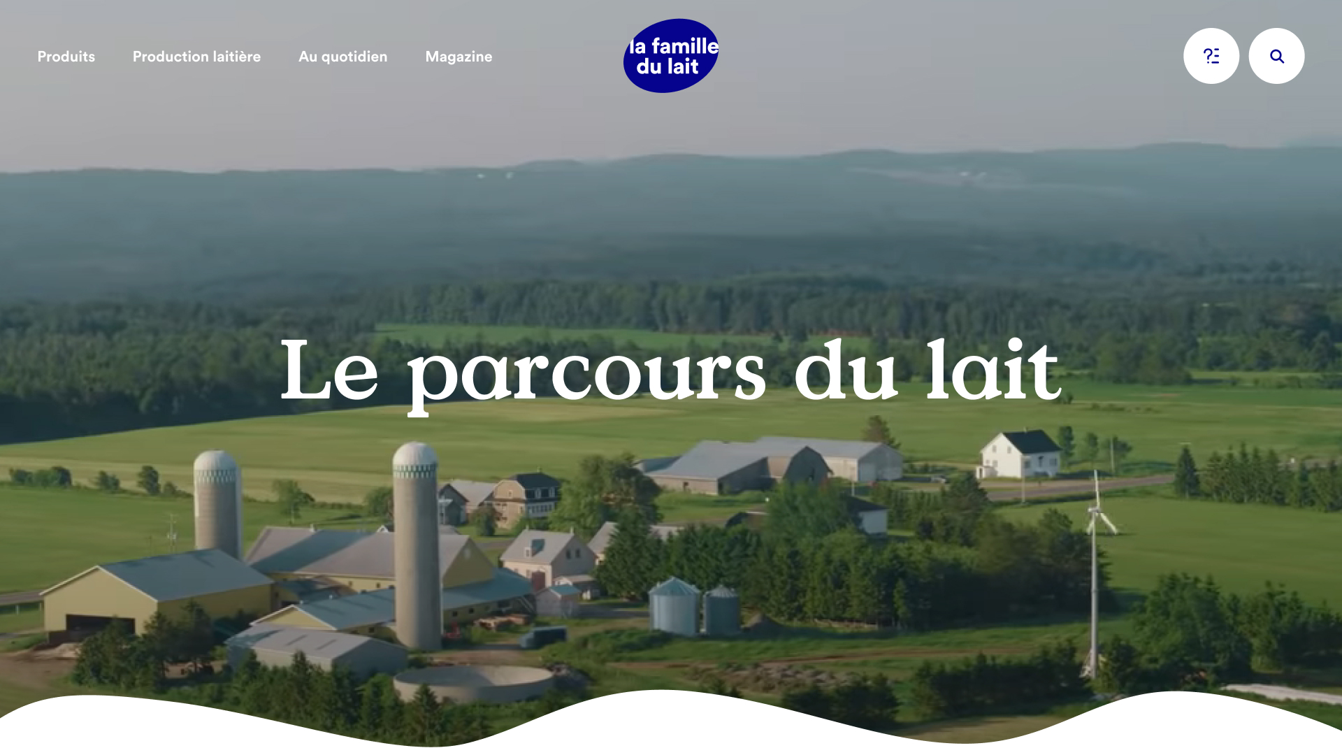
Q: What were some of your biggest learning and takeaways from this project?
A: This project gave us the opportunity to build a complete platform with scalability in mind, so it could withstand huge spikes in traffic following the client's major ad campaigns. We also perfected the art of handling video on high traffic pages without burning a hole in the hosting plan.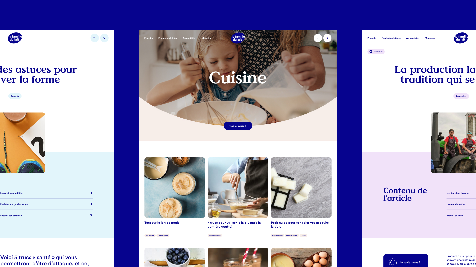
Q: What web technologies, approaches, tools, or resources did you use to develop this experience (WordPress, headless, AI, Sublime Text, HTML5, Adobe XD, etc)?
A: Front-end used Vue.js framework with Nuxt.js as a top layer. Back-end is based on headless CMS: DatoCMS. The website is statically generated and hosted on Netlify, for great performances and steady navigation. Animations have mostly been handled with a GSAP library and we used Algolia as a search engine. We used Figma for graphic design and Adobe Illustrator for illustrations. We used Cinema 4D for our 3D products and Redshift for renders.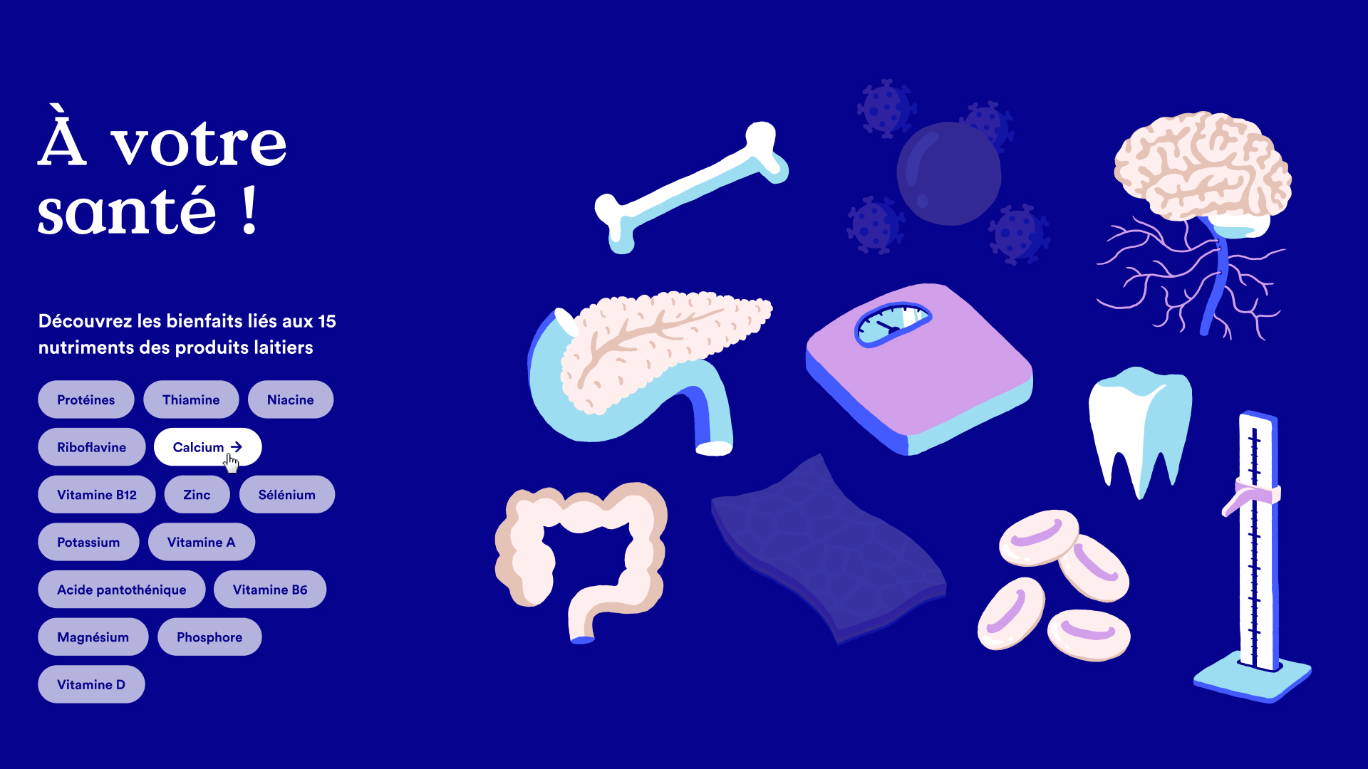
Q: How did the final product meet or exceed your expectations? What results did you see?
A: We were very impressed by the results. Not only did they exceed our expectations, but the content engaged much more people than we anticipated. Product page views increased by 189%, and user engagement skyrocketed, with the number of sessions seeing two pages or more increased by 487%.
Q: Why is this an exciting time to create new digital experiences? How does your team fit into this?
A: Corporate websites used to be boring. Today, with the help of technology and great content, we’re always sure to create a unique brand experience. The line between formats and platforms is becoming increasingly blurry, and it gives us creative flexibility. Our team is multidisciplinary, and we’re always on the lookout for people that have ideas and can conceptualize outside their specialty.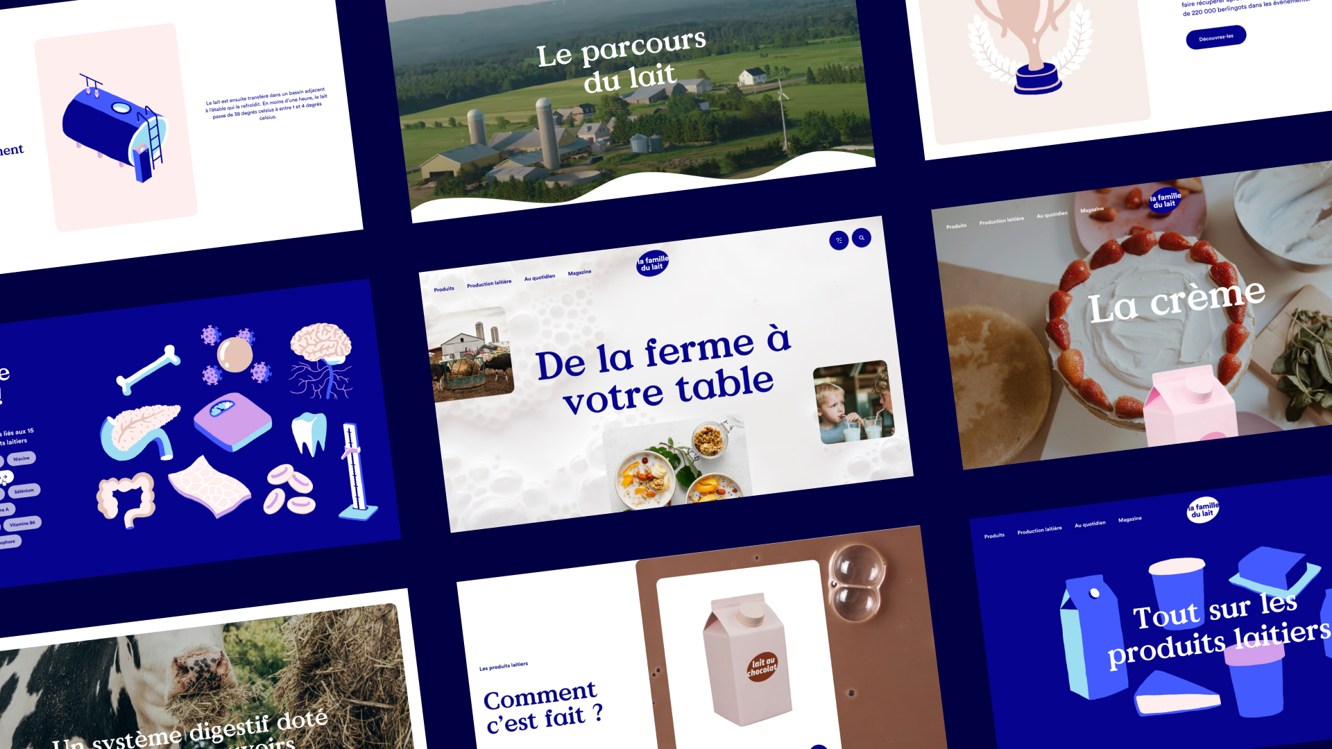
Q: How did you reach a good balance of your own creative ideas and technical capabilities with a fair representation of the client’s brand?
A: Our approach to every project is to bring our client’s brands to life, so it was no different for this one. We chose a technical solution that would answer to the functional needs of the project while also giving us the creative freedom that we needed in order to create an engaging branded experience. Through recurrent rituals and collaborative tools, we also made sure our clients had visibility throughout the whole process.