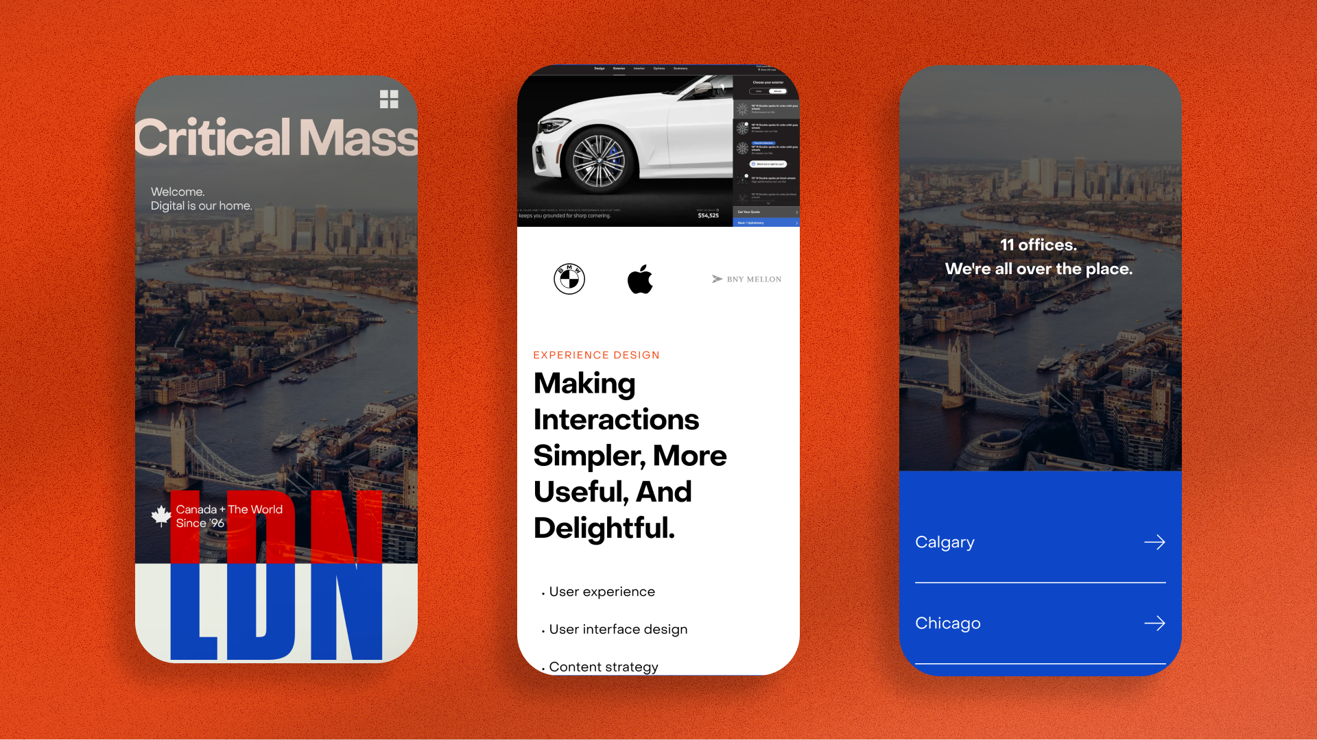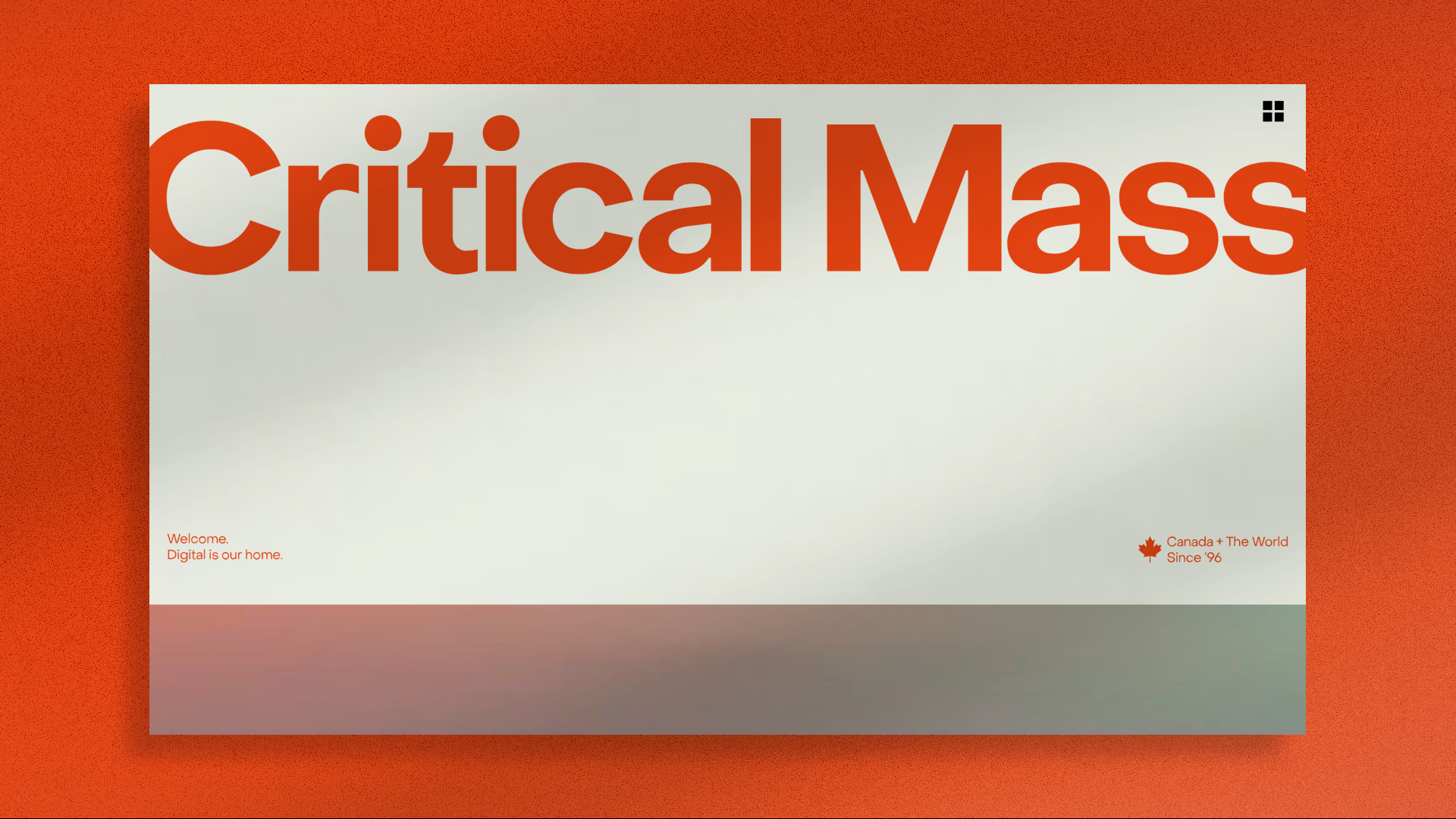
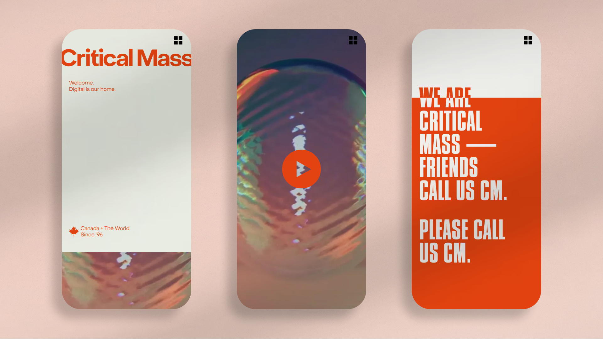
Critical Mass
Critical Mass Website
We Make the Complex Simple
Critical Mass Website
We Make the Complex Simple
Professional Services & Self-Promotion /
Honoree
Capturing 1,500+ individuals, 11 cultures, and 12+ verticals—all while serving world-class brands.Ferdi Wieling, Executive Creative Director, Global Design
Q: Once you settled on your idea, what influenced your decision on the chosen technical approach? How did it differ or go beyond approaches you’ve taken in the past?
A: In this agile sprint, our biggest conversation was about performance. Prioritizing a seamless experience for all versus a snazzy experience for a few became our technical north star. With that comes a layering of decisions and negotiations. How should it feel when visitors scroll—a glossy WebGL feel versus native scrolling on a trackpad? What looks better versus what performs better is a different collaboration than: Here’s the layout. Go build.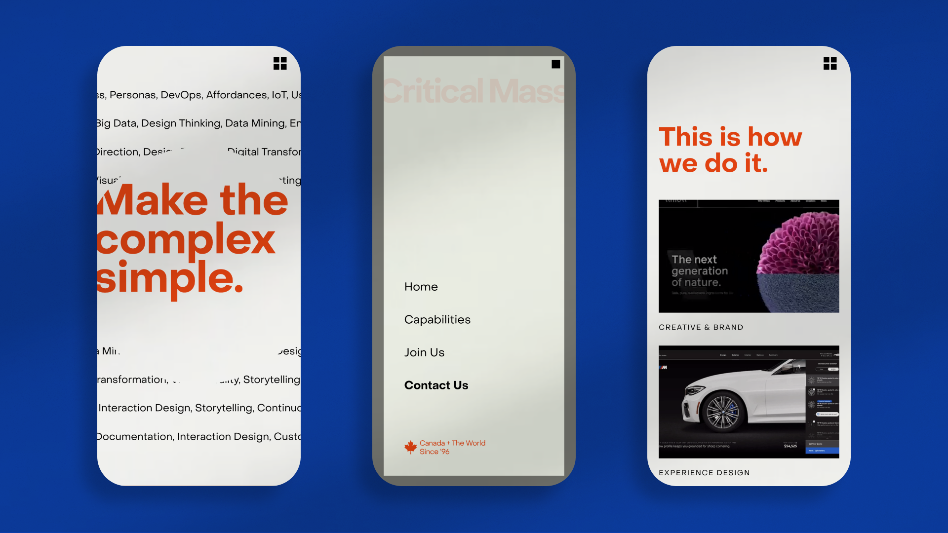
Q: What were some of your biggest learning and takeaways from this project?
A: Being true to our values is essential. And we walk the walk. A digital brand needs to be digitally accessible. That means learning how vital accessibility is, for example, to our color palette and adjusting to fit. As a brand expression, creating a representative experience for 1,500+ experts is the first and most vital starting point for creating brand love—something worthy of their pride.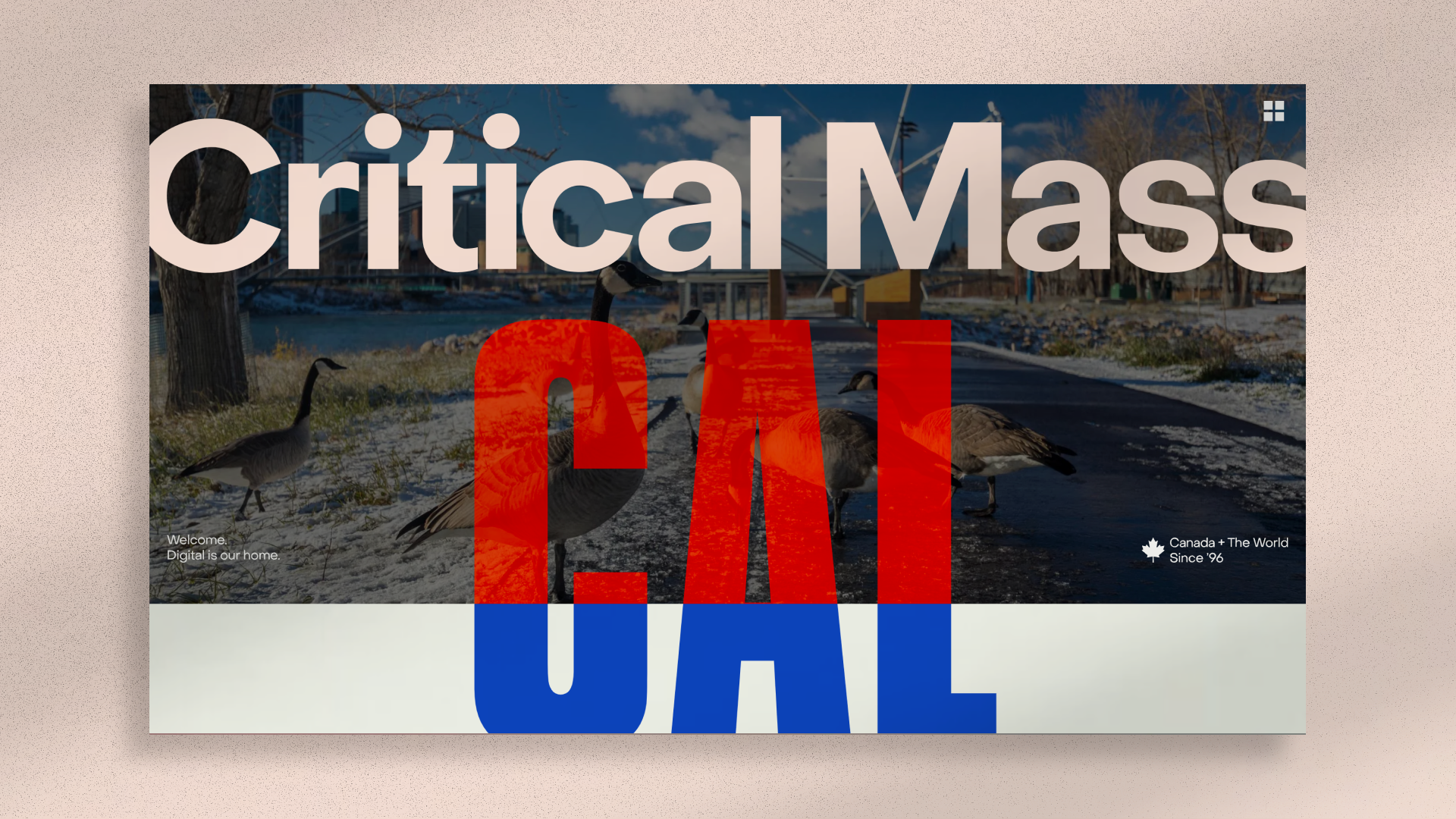
Q: What web technologies, approaches, tools, or resources did you use to develop this experience (WordPress, headless, AI, Sublime Text, HTML5, Adobe XD, etc)?
A: We didn’t want to go down the road of over-engineering, so the codebase itself needed to communicate simplicity, clarity, and performance. To achieve this, we chose the Astro Framework, Vue, and GSAP. All 3 provide powerful yet clean implementations when compared to other libraries. Everything else under the hood is well crafted vanilla JavaScript and simple CSS. We are proud of how the site feels for a user and our stellar Lighthouse scores.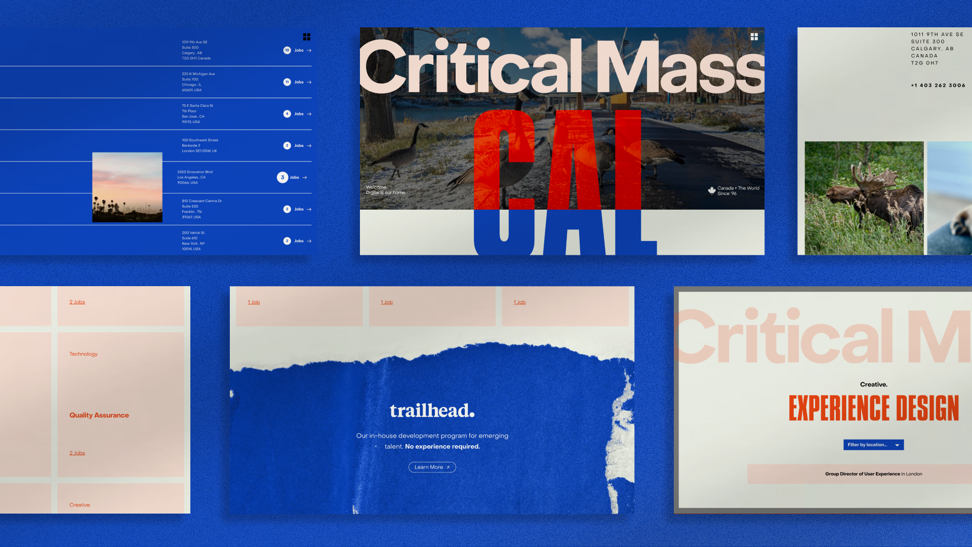
Q: How did the final product meet or exceed your expectations? What results did you see?
A: This project does not oversell itself. As such, it was well received as accurately representing those who work in a modern, bustling agency. For an agency website, it’s rare to welcome with no BS—instead of a bold and human welcome. This uncommon balance comes through between confidence and arrogance; not trying to do too much from technical to copy to design; and showcasing without pretense. The result is polished—a quiet confidence that’s real.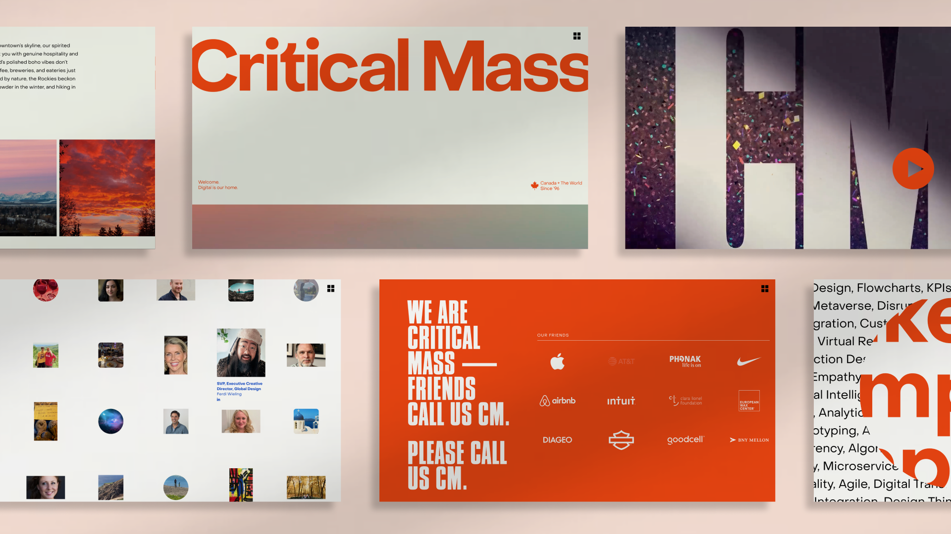
Q: Why is this an exciting time to create new digital experiences? How does your team fit into this?
A: It's not an exciting time. It's a terrifying time. Stakes have never been higher. Technology has never been more disposable and misunderstood. Client expectations? Never been greater. Any knowledge-share on the latest generative AI is outdated by the time we finish scheduling the meeting. And yet! —In the face of volatility as the new industry standard, we remain responsive. Moving. Reinventing. That’s exciting. And worth phoning home about.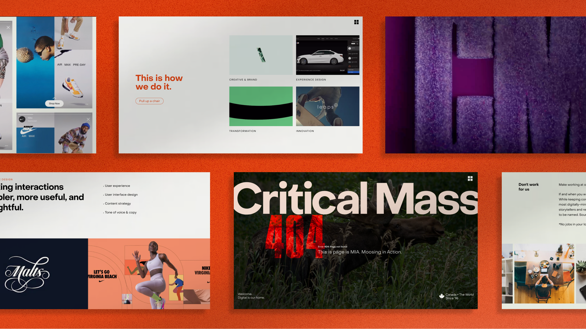
Q: How did you reach a good balance of your own creative ideas and technical capabilities with a fair representation of the client’s brand?
A: Staying on the same page, super skilled and real—we made decisions with inclusion and range in mind. We queried the agency for GIFs, made-up words, even “what’s out your window?” That community generated content helped define tone, even asset gathering (down to images of moose) which kept us far away from stock-like feels. Likewise, you’ll find a multifaceted family-portrait wall of execs that shows personality range with pixel-perfect precision.