
Studio Dumbar (part of Dept)
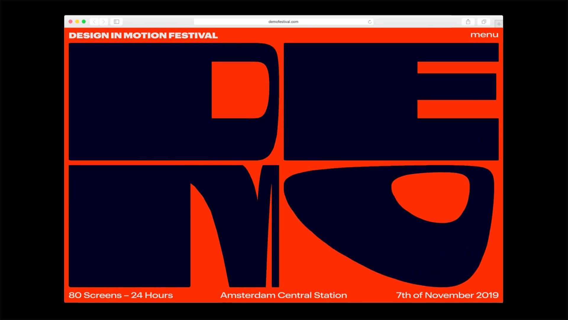
DEMO -
DEMO -
Design
in
Motion
Festival
Best Use of Animation or Motion Graphics /
People's Voice Winner
Studio Dumbar (part of Dept)
Best Use of Animation or Motion Graphics
People's Voice Winner
We kept pushing the way we could use the movement of the letters and how we could control (or randomize in some cases) the visuals it generated. This made for a dynamic design process where nothing was set from the beginning.- Studio Dunbar Team
Q: Talk about your initial prototypes. How did those ideas change throughout design and execution?
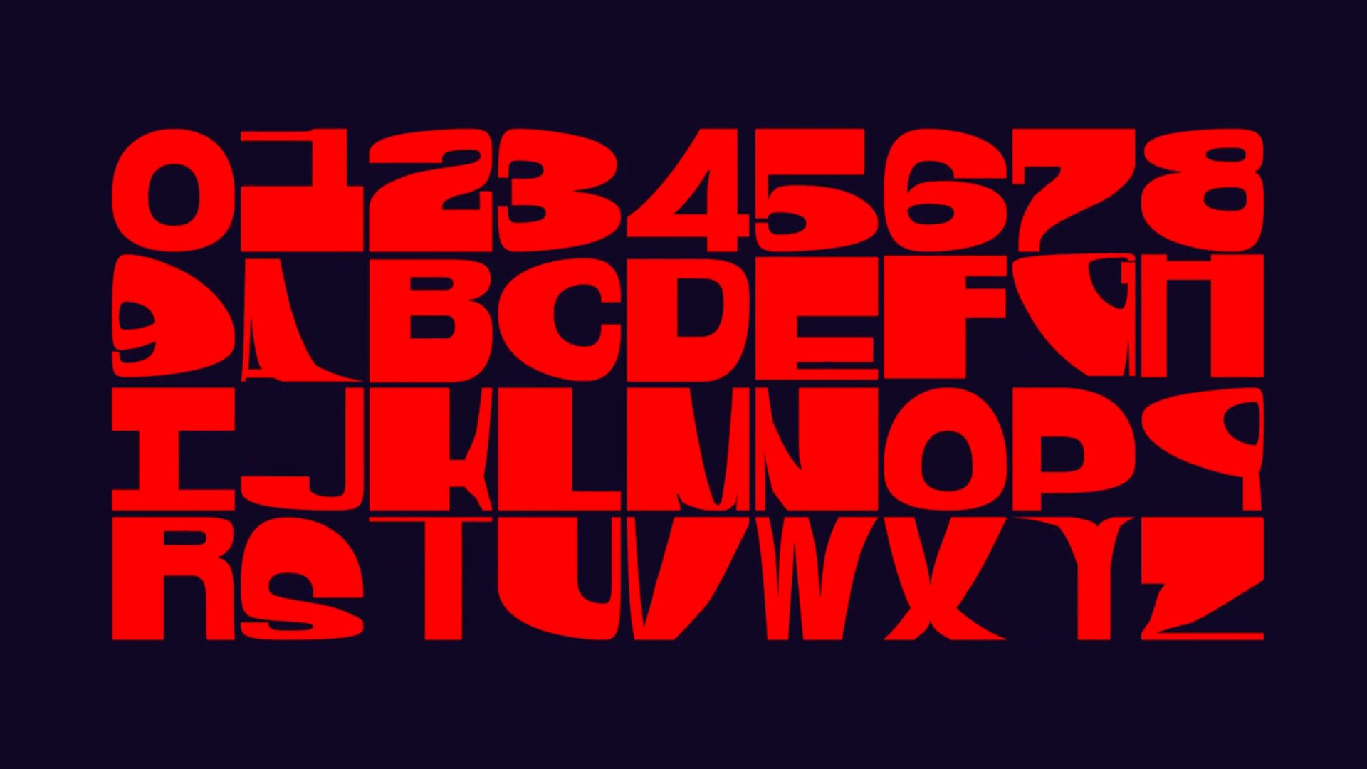
A: The idea of the distorting letters came from a free sketching app on iPads, where one of our designers was playing around with transforming pictures. Using this to distort letters gave us the basic idea of what the visual identity should feel like. We couldn’t replicate this movement in the known (motion) design software apps, so we decided to develop our own tool. In doing so the whole design process was linked to what the tool could do, and vice versa. We kept pushing the way we could use the movement of the letters and how we could control (or randomize in some cases) the visuals it generated. This made for a dynamic design process where nothing was set from the beginning.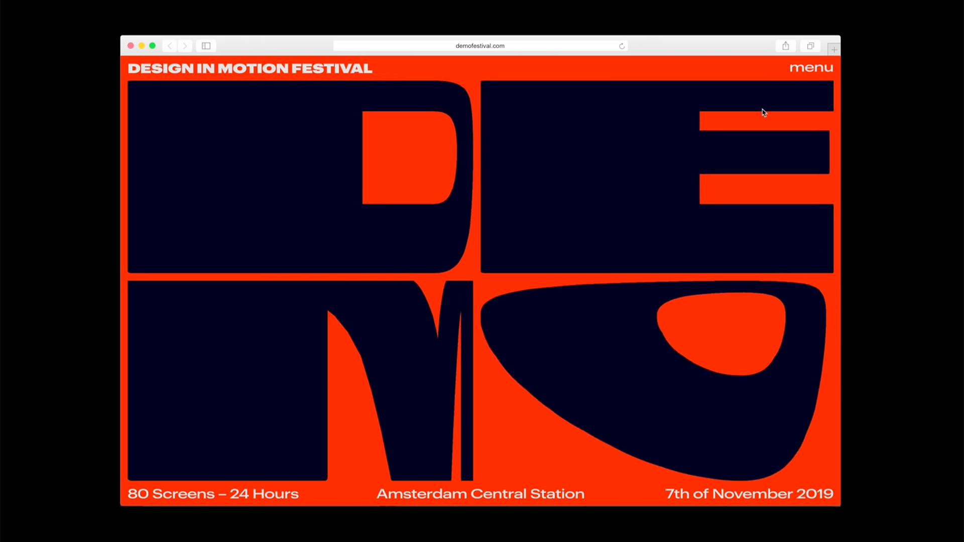
Q: What web technologies, tools, or resources did you use to develop this?
A: The tool itself is built in Processing. So all the visuals you’ll see on the website are made in our own developed tool with some post editing done in After Effects. The interactive elements are made in P5.js, which is the JavaScript equivalent of Processing. The rest of the website is built in the flat file CMS Kirby.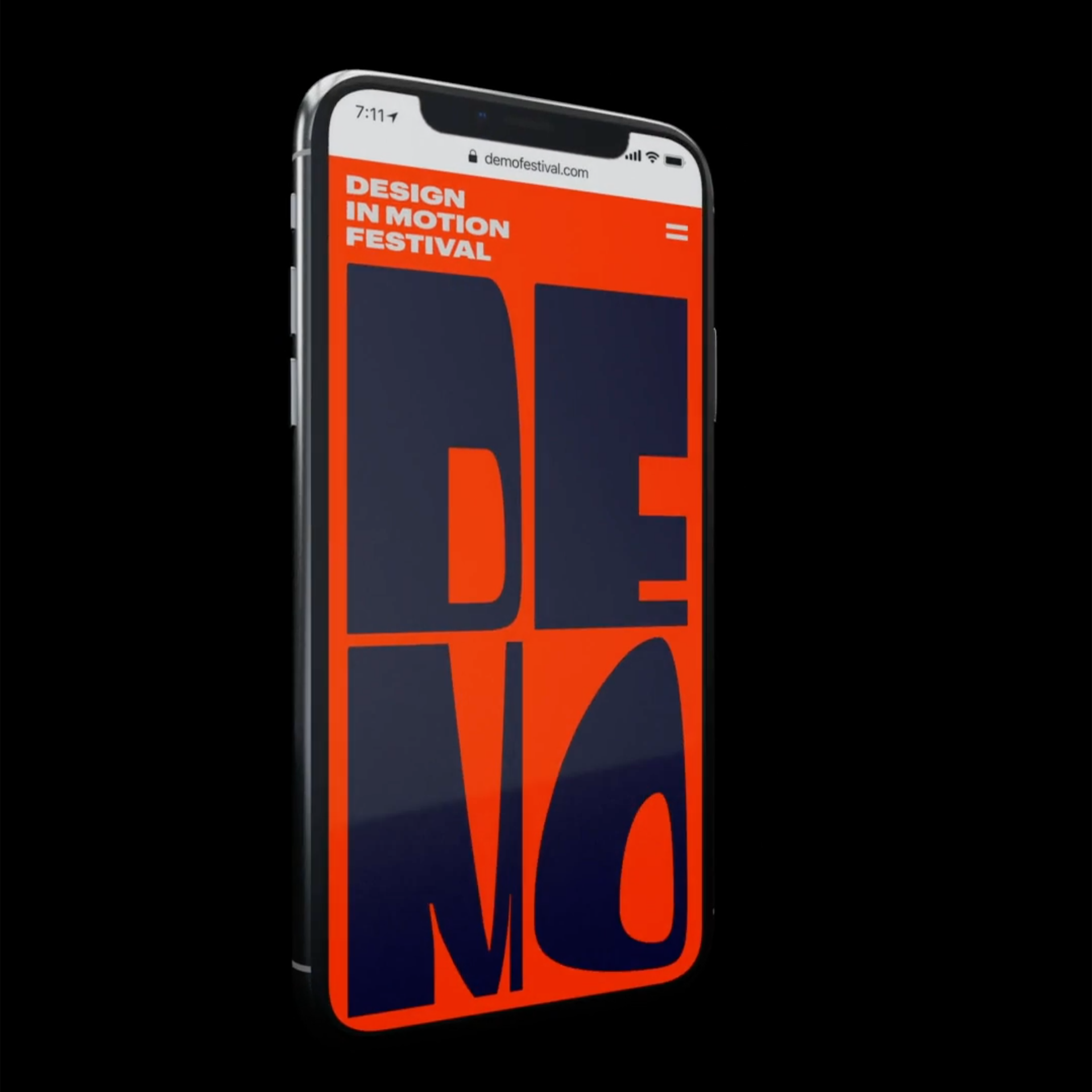
Q: What influenced your chosen technical approach, and how did it go beyond past methods?
A: Since we had a lot of fun playing around with the tool we developed while designing, we wanted to give website visitors this same experience. Instead of having a small logo in the top left corner of the website, the whole screen is filled with an interactive logo—responding to mouse or gyroscope. We used the concept of always filling up the possible space and built the website around it. For example, the desktop menu will push the content of the website into each other instead of covering it up. The layouts and design of the rest of the pages were based on this technological concept, instead of starting with a design and layout and later added technology to make it move or interactive.What breakthrough or “a-ha” moment did you experience when concepting or executing this project?
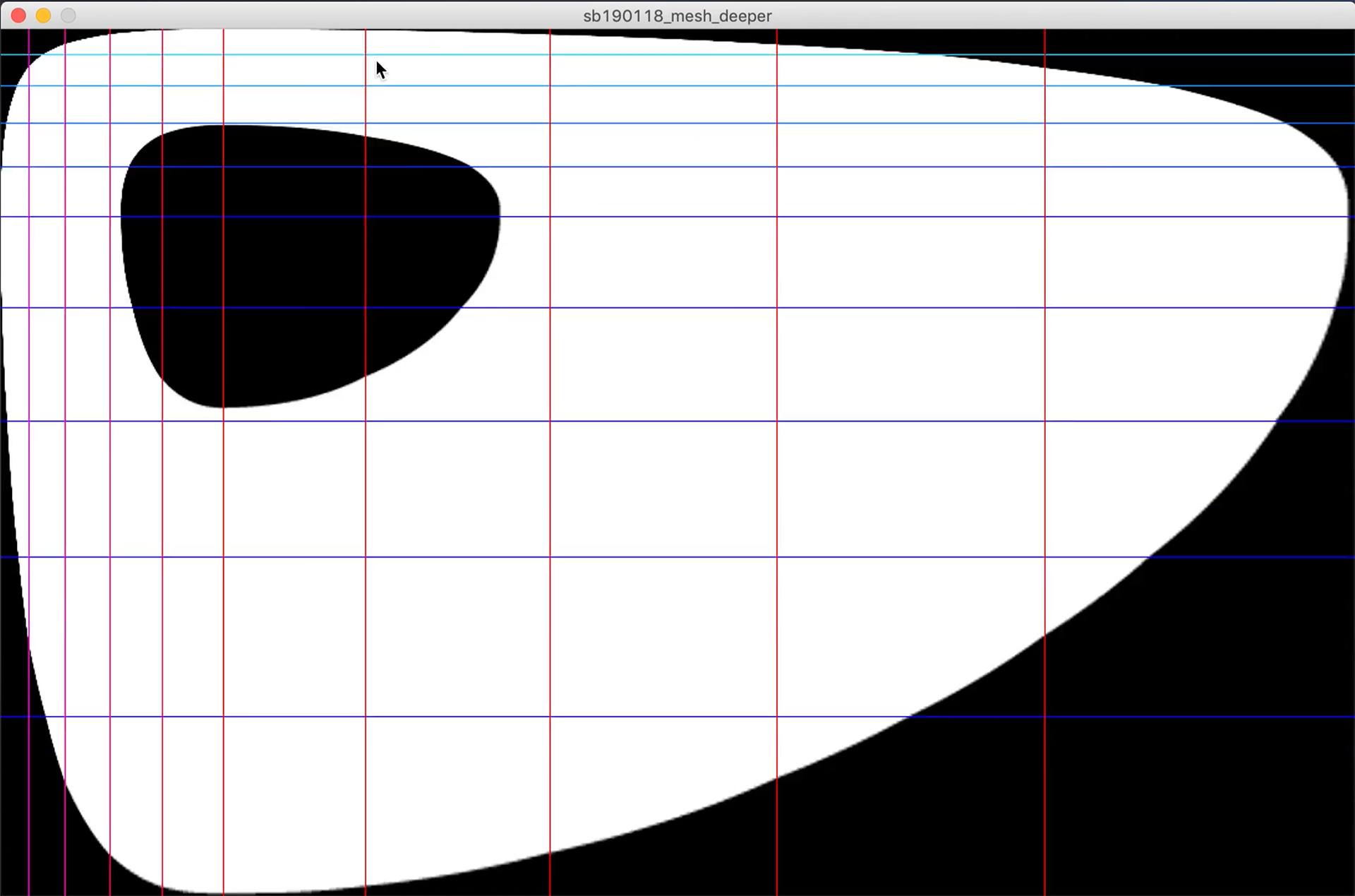
It took us a while to figure out how exactly we could make the distortion of the letters happen. We wanted to distort and move the letters, but not adjust their boundaries so they would always be (somewhat) legible, and fit their frame. Oftentimes with static design, the first thing you do is start with a grid. After some failed attempt to create the motion we wanted, we started with generating a moving and interactive grid first. Once this was working, we used that technology and filled the grid with tiles to form the letters.