"As a design studio that has experimented with many creative formats, we are confident in our minimalist approach — everything that you see on the site is there for a reason."Studio Airport Team

Q: Tell us about your initial moodboard, wireframe, or prototype. How did things change throughout the process?
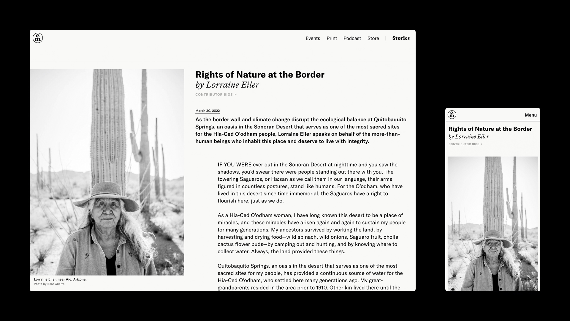
A: As this was a re-build rather than a new project, we had a strong foundation. Many of the initial wireframes were pretty close to the final design. One exception was the gallery template for photo essays: we struggled to find a format that provided the immersive experience we wanted. After several prototypes, we landed on a traditional vertical scroll format with ample space for images, paired with several enhanced interactions.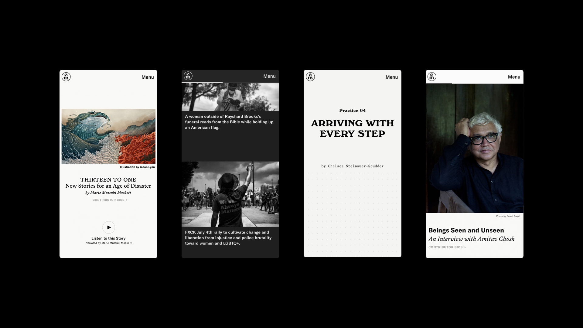
Q: What influenced your chosen technical approach, and how did it go beyond past methods?
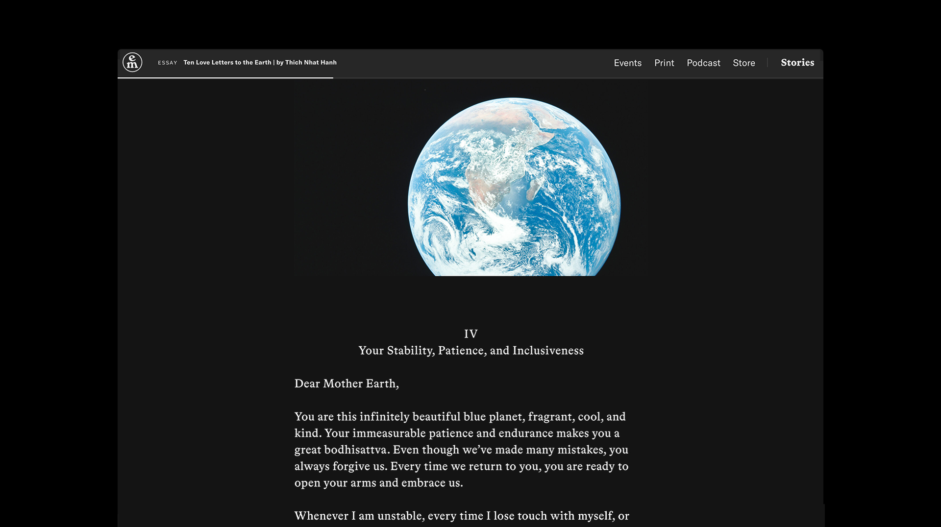
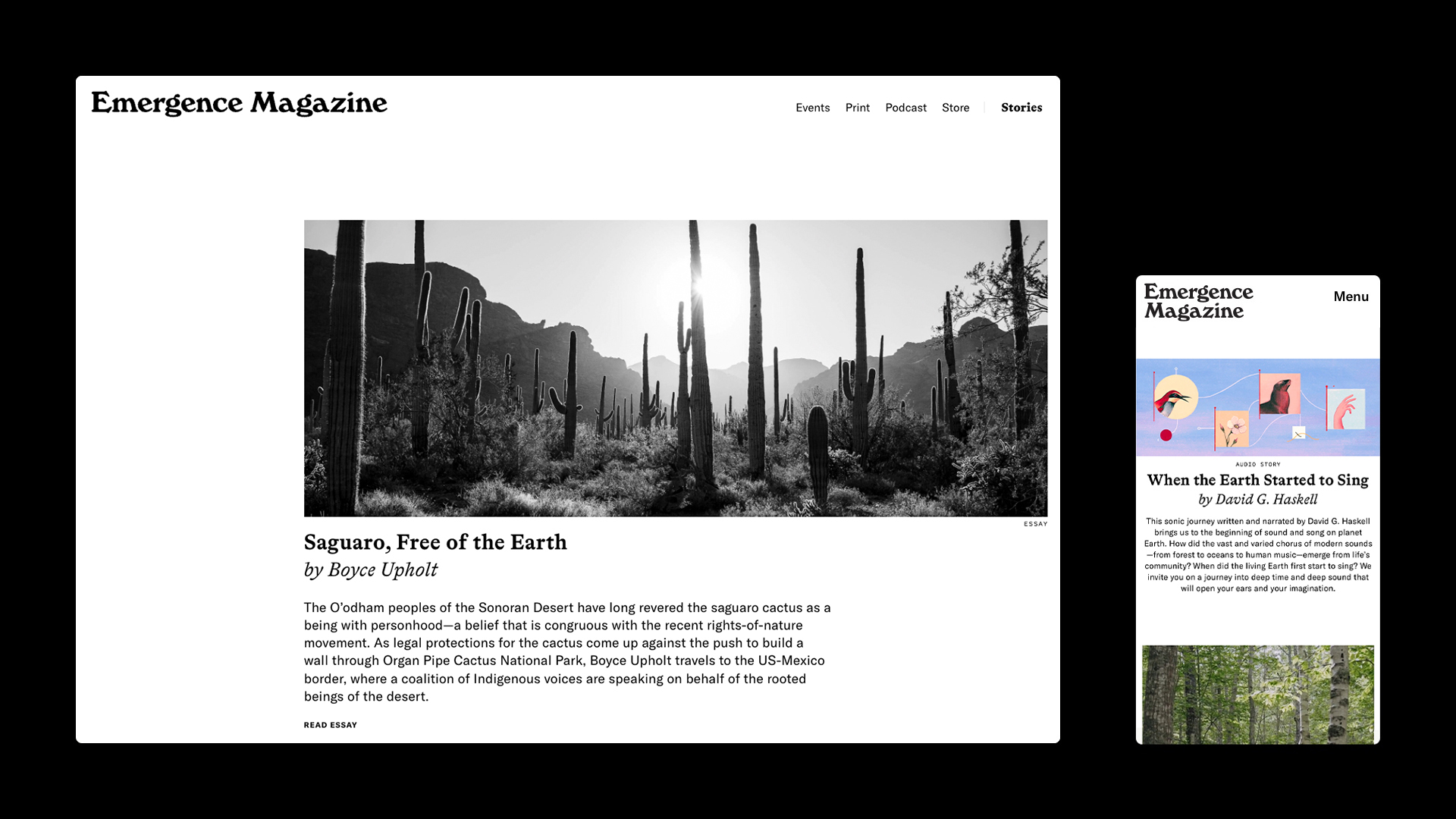
A: Our technical approach was highly influenced by our simultaneous work on the magazine’s second print edition. We wanted the design solutions of these two very different mediums to relate to each other, while preserving their own unique-feeling qualities. Every new story format for the website drew from the "print design approach.” We hope that users feel the intimate quality of print as they navigate this virtual space.When did you experience a breakthrough or an "a-ha" moment during this project?
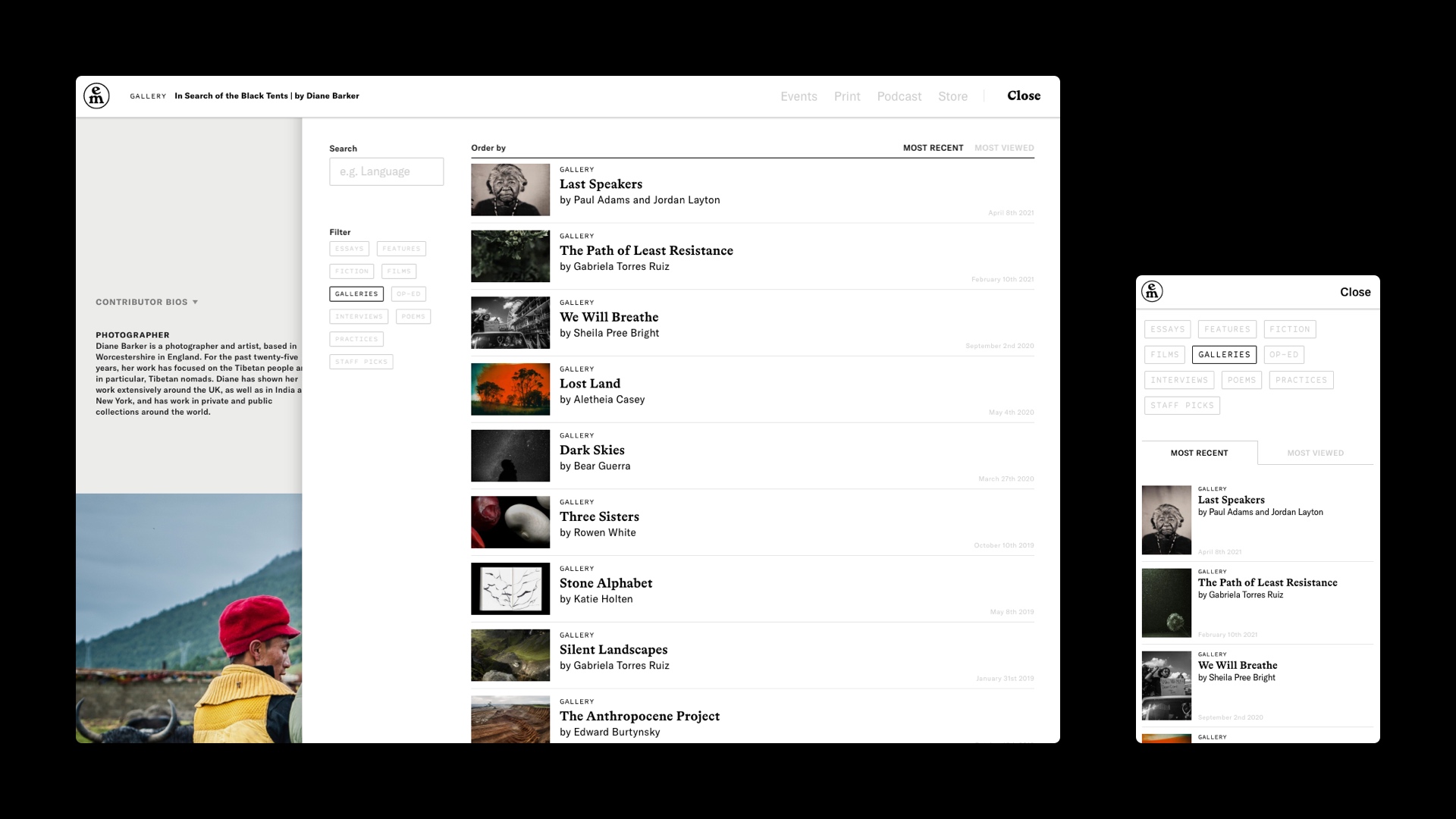
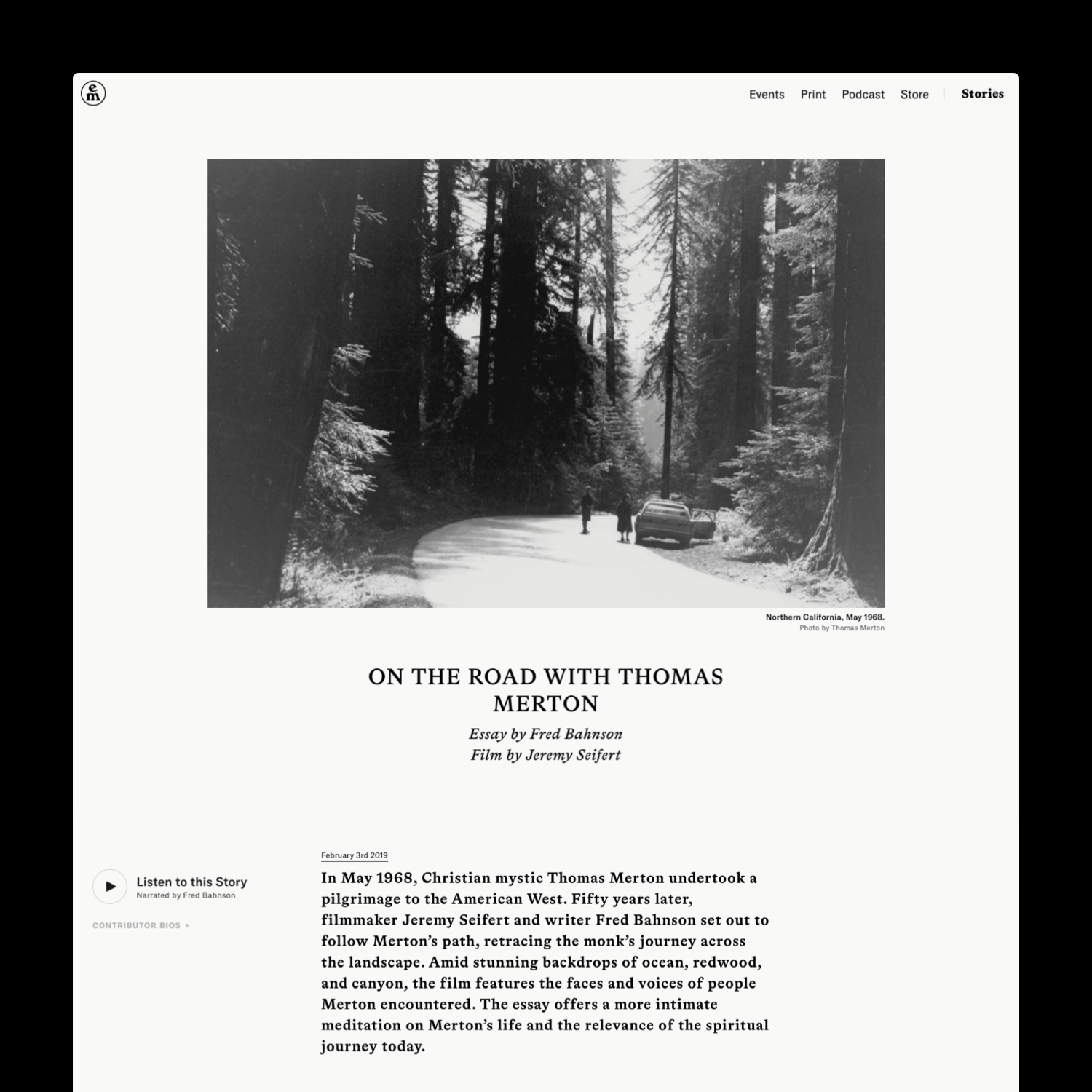
One of our challenges was creating a flow in which the user could immerse themselves fully in a story and still easily navigate back to an overview of the magazine’s content. We achieved this with a library index—including a filter system and a search engine—that can be accessed from anywhere on the site. The moment we placed the word “Stories” in the top right corner of this index, everything suddenly began to click.
Q: What web technologies, tools, and resources did you use to develop this?
A: We primarily rely on Sketch as our go-to design tool. Additionally, we use Keynote and After Effects when animating hovers, transitions, and micro animations in order to ensure that the developers have a clear understanding of our intention and vision. For front-end development, we stick with the basics. For the back end, we use Wordpress, which has proven to be a platform that is extremely well-suited to our needs.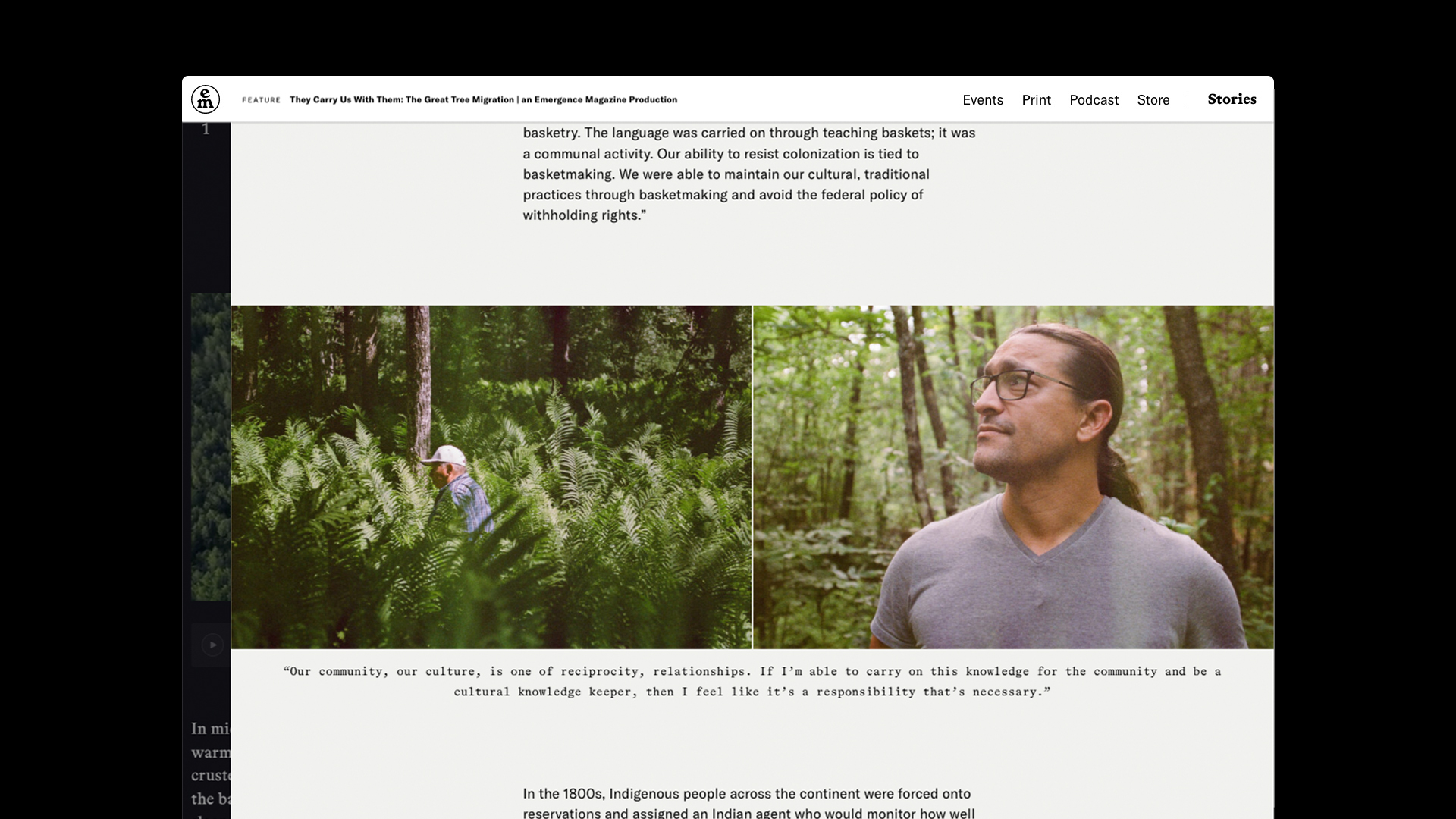
Q: How did you balance your own creative ideas and technical capabilities with a fair representation of the client’s brand?
A: Over the past five years, we’ve built a strong relationship with the editorial team. We’re generally on the same page regarding the direction of the brand and any technical and design requirements that we want to achieve. That being said, we sometimes disagree on visual concepts or technical possibilities. In some cases, we’ve had to tone down visual effects in order to increase performance but, happily, there is never much that gets left behind.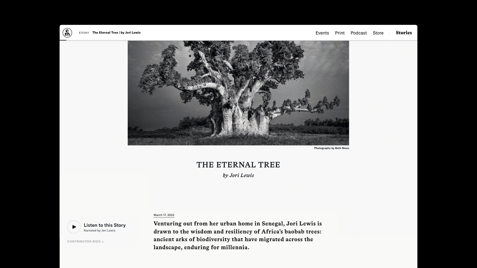
Q: How did the final product meet or exceed your expectations?
A: The bar is always set high by both our editorial and design team. Although we always begin the process with a lot of ambitious ideas for how a final product will function and look, we work to discern what is most important and then strip everything down to the essentials. As a design studio that has experimented with many creative formats, we are confident in our minimalist approach—everything that you see on the site is there for a reason.