Oyster Fruit Studio
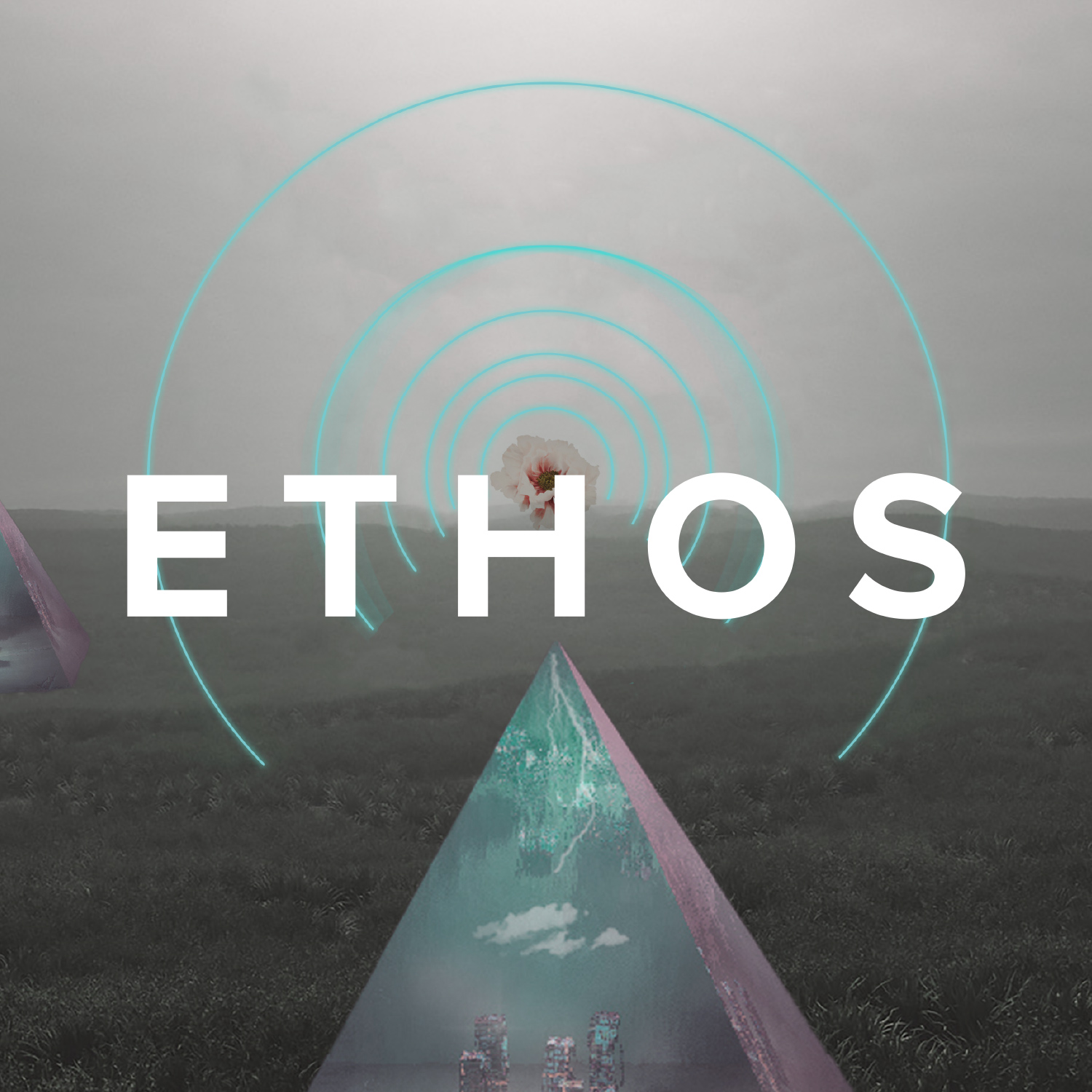
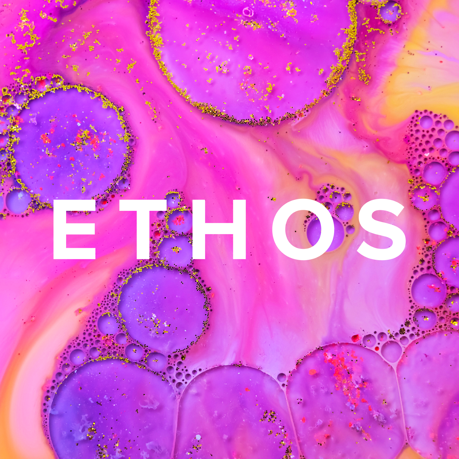
ETHOS Genetics
Pushing boundaries in cannabis education.
ETHOS Genetics
Pushing boundaries in cannabis education.
General Websites and Mobile Sites /
Honoree
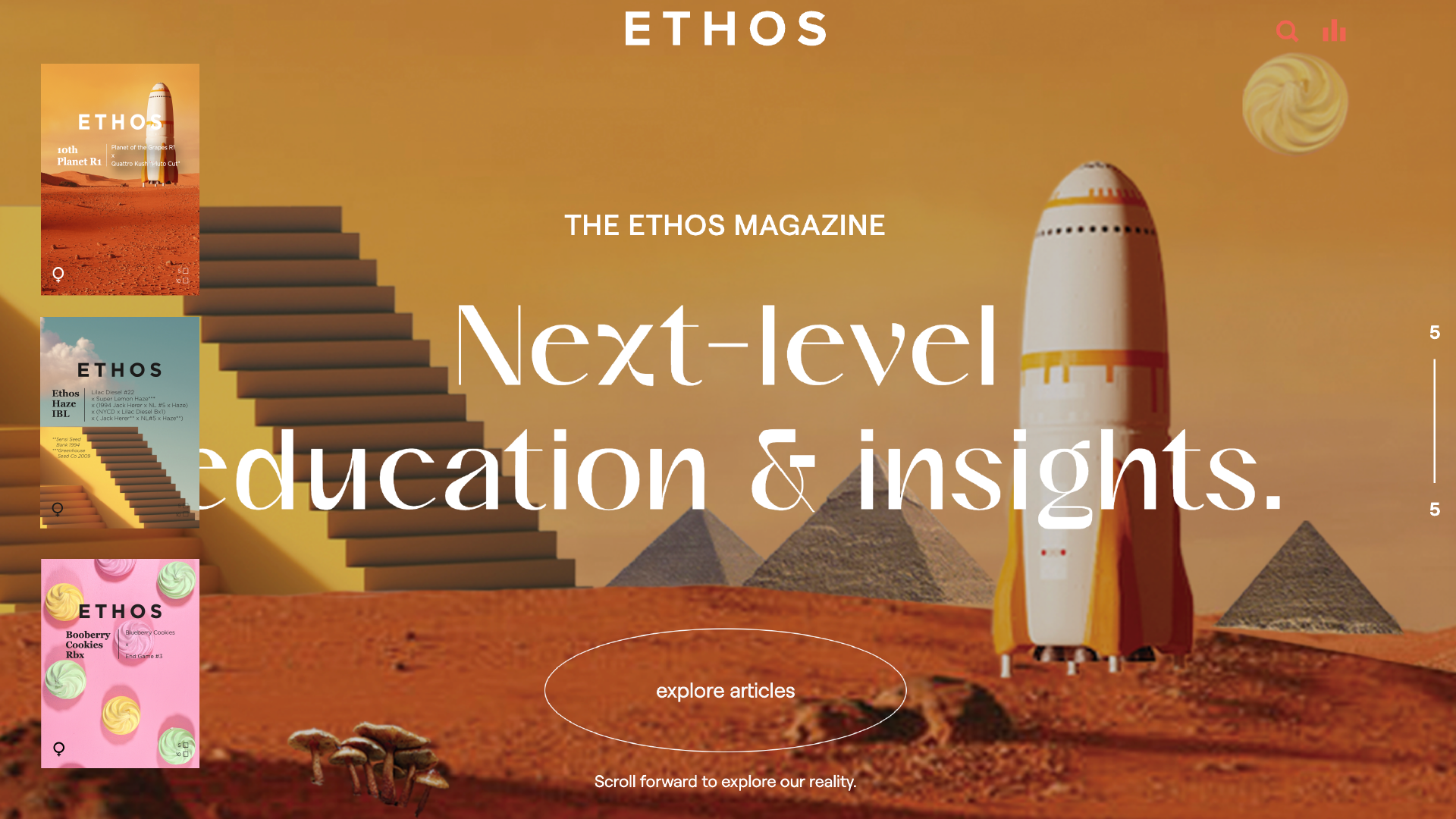
We created a dreamy, immersive world that puts education and functionality in the spotlight.Ksenia Slavina UI/UX Designer Viktor Sman Developer Lauren Astl Copywriter
Q: Once you settled on your idea, what influenced your decision on the chosen technical approach? How did it differ or go beyond approaches you’ve taken in the past?
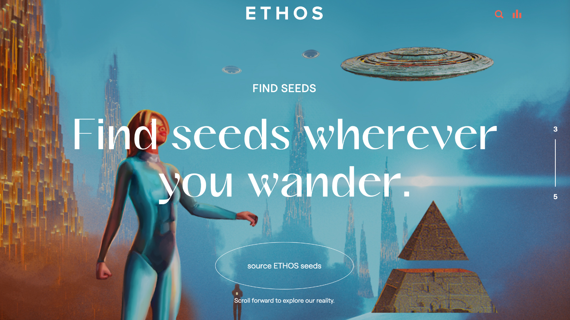
A: We called our concept, “The ETHOS Universe.” We wanted users to be able to travel from world to world, picking up glittering bits of inspiration along the way. Our approach was to develop a 3D scroll experience to lead users through that journey. We had never created anything like this! Our developer became our favorite creative collaborator. We had to build every detail from scratch, learning together, and finessing through trial and error.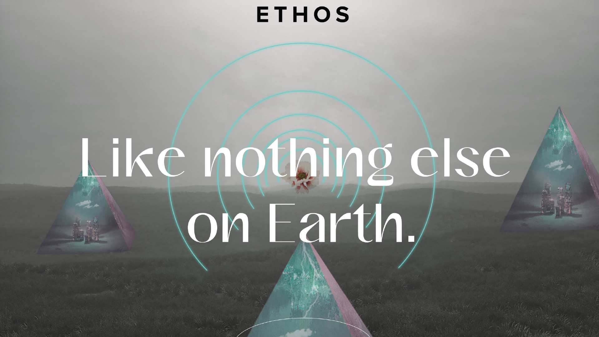
Q: What were some of your biggest learning and takeaways from this project?
A: Knowing your user is everything. We built a system that filters seeds by flowering time, yield, effects, even terpenes. Now, a user can think to themselves, “I want a plant that smells like red wine, grows well indoors, and produces a massive yield,” search for those exact qualities, and find a match. But creating that experience from scratch required us to get in the mindset of every user, from first-time growers to hobbyists to breeding experts.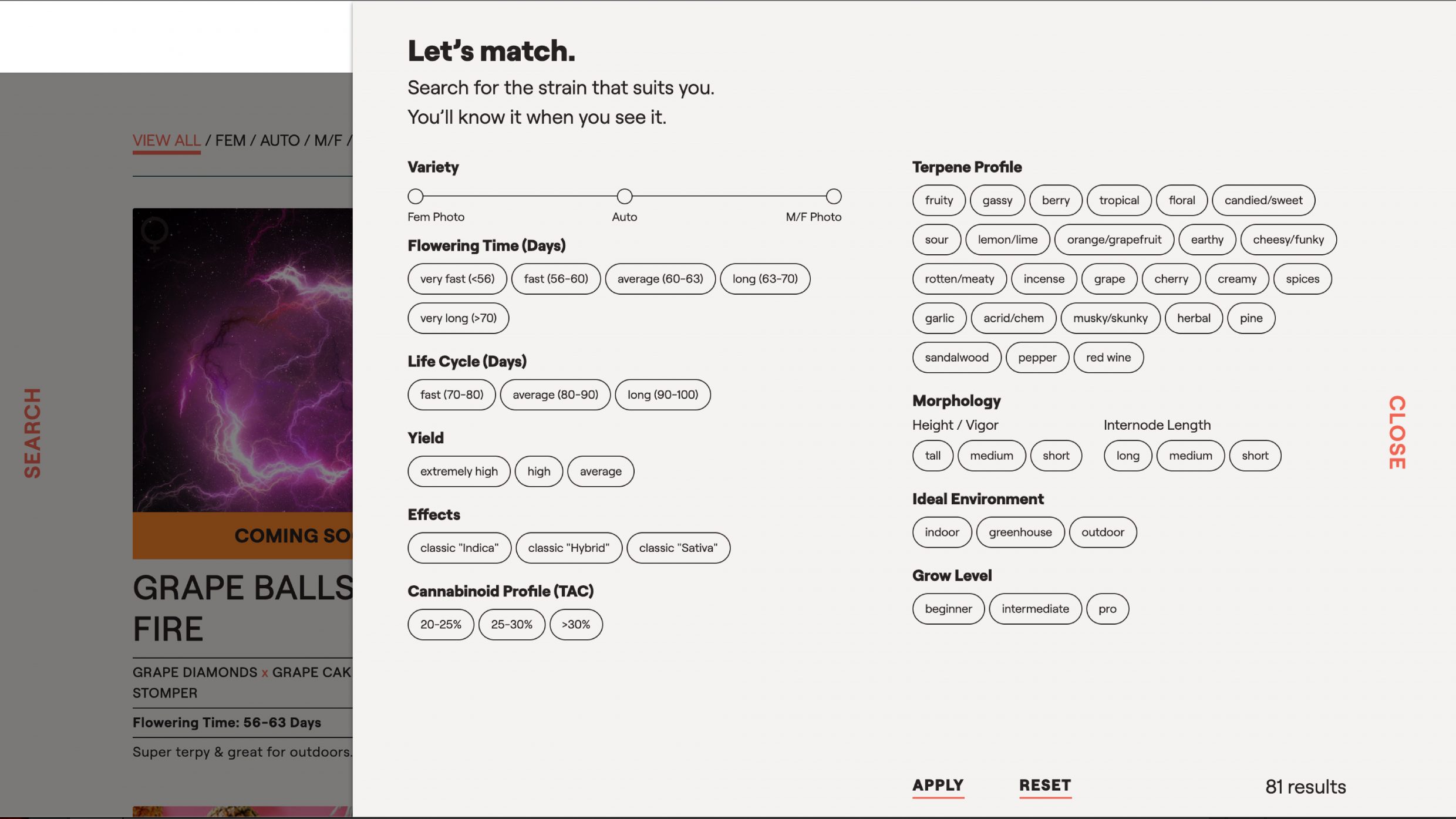
Q: What web technologies, approaches, tools, or resources did you use to develop this experience (WordPress, headless, AI, Sublime Text, HTML5, Adobe XD, etc)?
A: We used everything! We planned our designs on Sketch, and built the website on Wordpress. We used JavaScript and custom CSS—and there’s a lot of it. Custom CSS is used on every page of the site. We used JavaScript to program a robust, highly specific filter system, implement global search, and create the 3D scrolling worlds. Photoshop was the key to altering the packaging elements and collaging each landing page.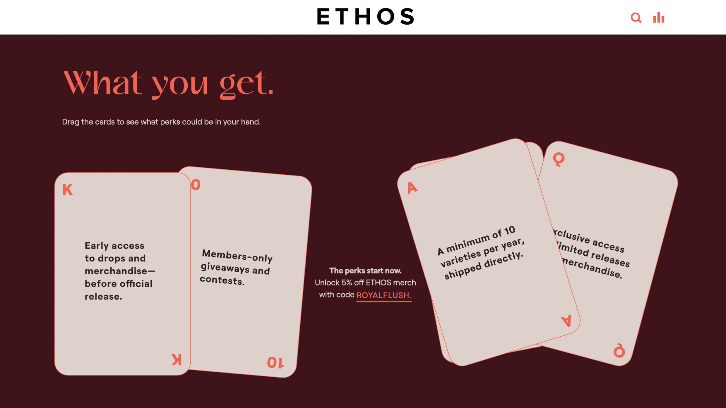
Q: How did the final product meet or exceed your expectations? What results did you see?
A: The excitement from users went way beyond our expectations. They started writing in, thanking our client for posting so many mind-opening resources. The thing is, those resources were published on ETHOS’ old site too! They just weren’t interesting to look at. Some people argue that simple designs are the best fit for educational content, but we can’t possibly agree. This weird, whimsical journey is what connected users to the information.
Q: Why is this an exciting time to create new digital experiences? How does your team fit into this?
A: In the digital realm, you can create anything—positive or negative. We like to use our branding magic for good, and find unusual ways to answer questions. Like with this site: people might just want to know which cannabis seeds will grow well outdoors, but now they take a neon tunnel to get there. Immersive mobile experiences are a huge source of inspiration for us. We push ourselves to reimagine what it can feel like to learn on the go.
Q: How did you reach a good balance of your own creative ideas and technical capabilities with a fair representation of the client’s brand?
A: Our visual inspiration came from ETHOS’ packaging, so the project was always grounded by their existing branding. We choose clients who share in our creative spirit, and allow us to lead them into uncharted territory. Our role as storytellers is to uncover the most ownable part of a brand and bring it to life. In our first meeting, ETHOS told us they wanted a website that “feels like flying to a different universe." Then, they let us run wild.