Springload
Klim
Klim
Type
Foundry
Website
Best Visual Design - Function /
Nominee
Springload
Best Visual Design - Function
Nominee
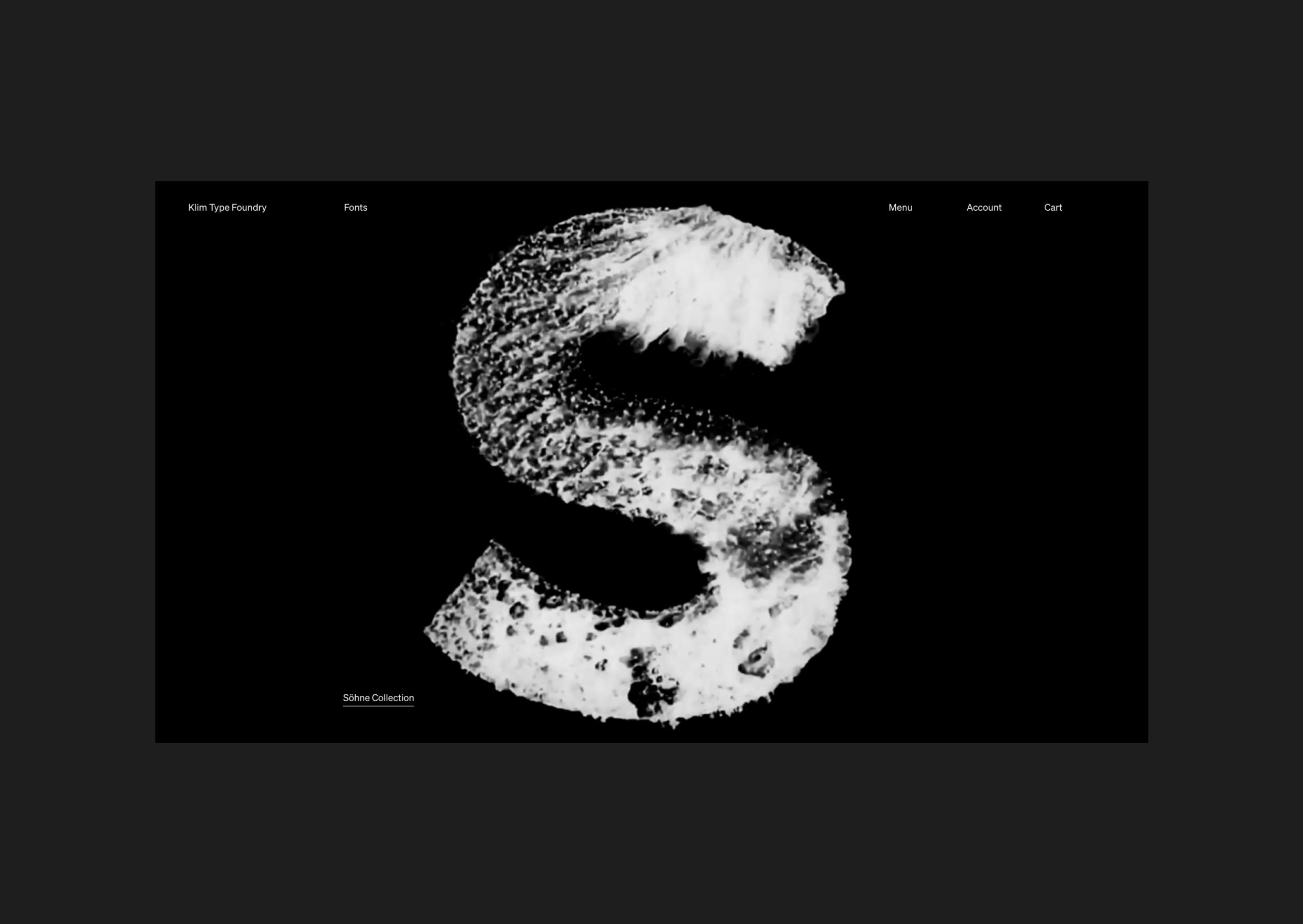
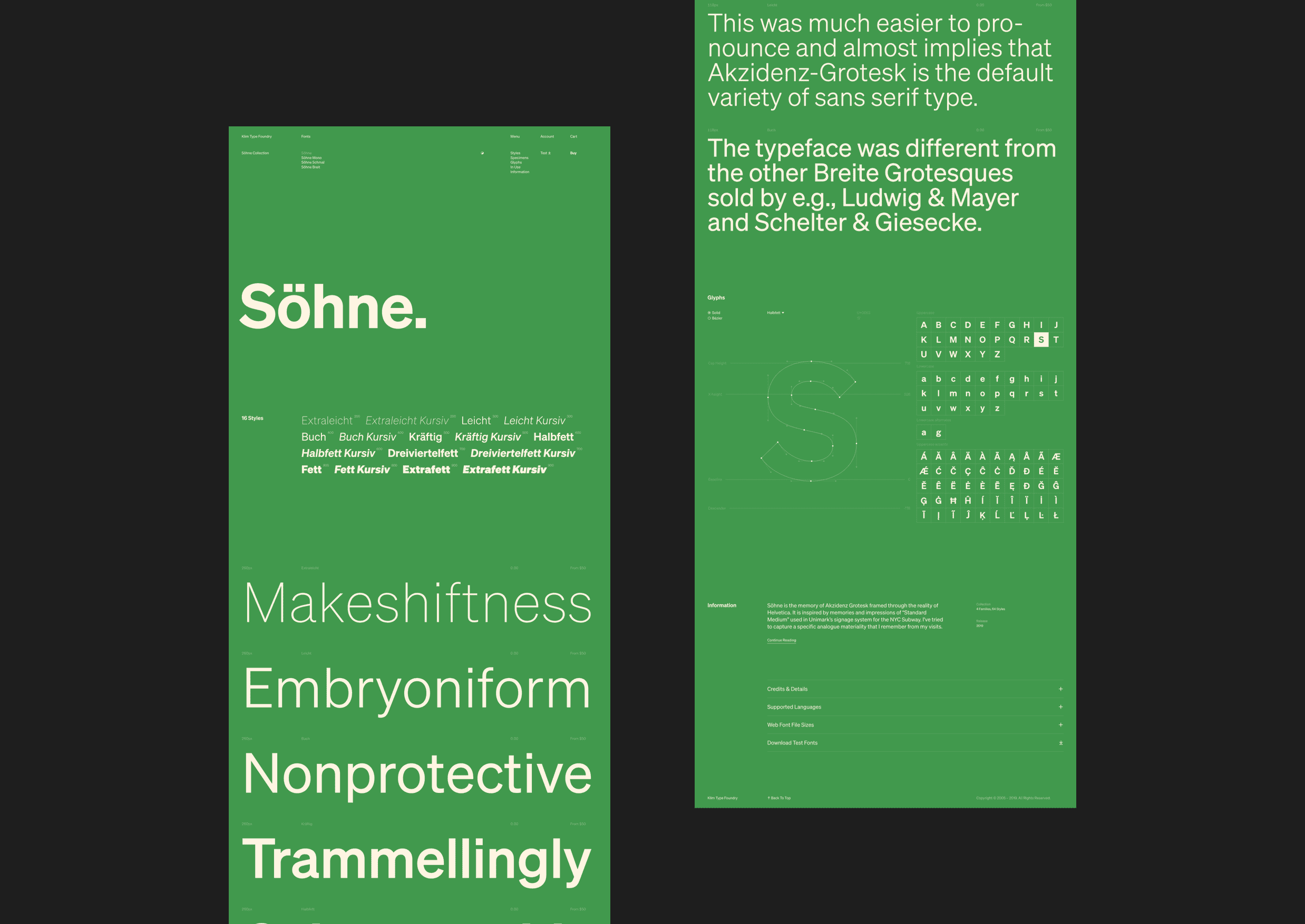
"We wanted the experience to be effortless, informative and interesting, and for buyers to encounter a straight-forward and direct purchasing and licensing process. Aesthetically, we wanted the redesign of the site to complement Söhne, which is our new brand font."- Kris Sowersby, Klim’s Director
Q: Talk about your initial prototypes. How did those ideas change throughout design and execution?
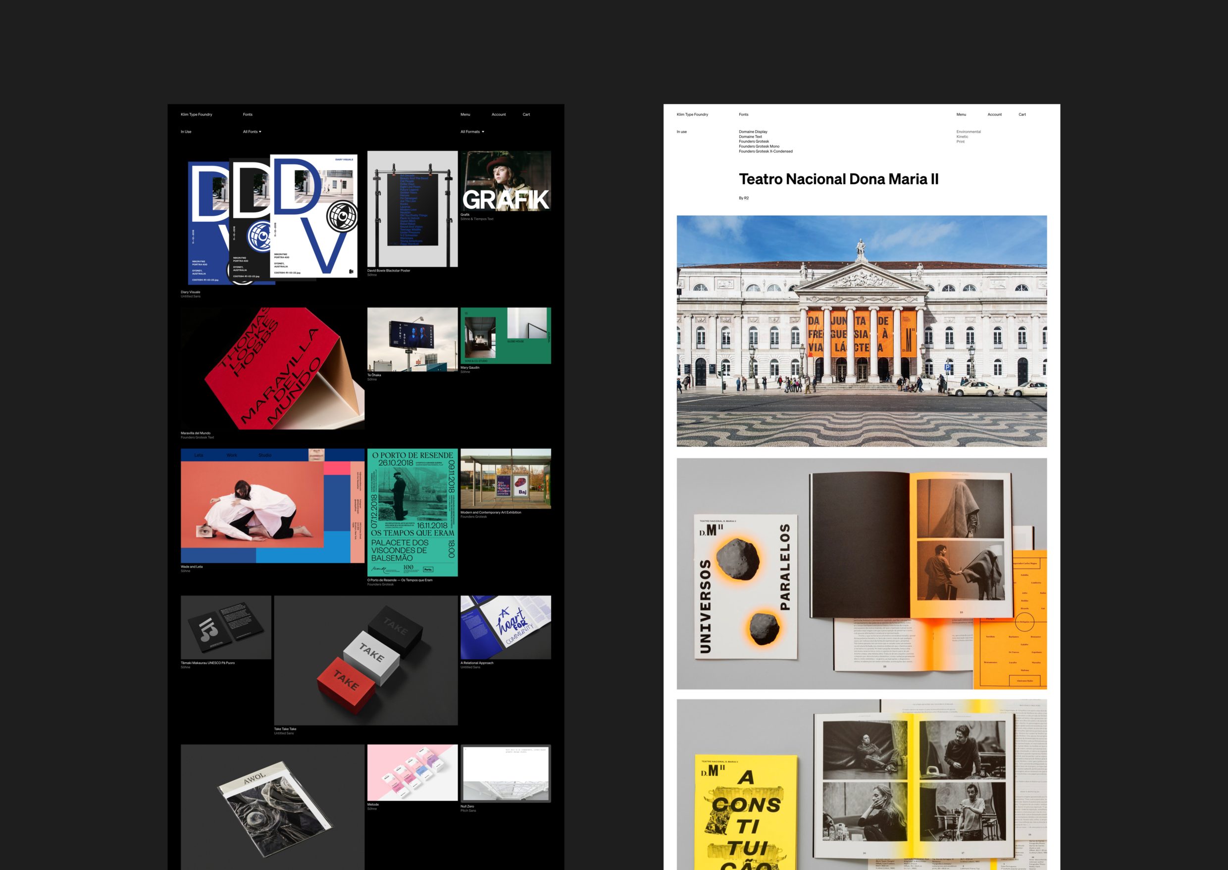
A: The brief was informed by interviews with returning, new and potential customers, usability testing the old site, and prototyping of initial concepts in design software and code to validate and further test a variety of approaches. This process confirmed the data built up over six years; that is, visitors come to Klim to browse and buy, but they also come for font design information, behind-the-scenes articles on typeface craft, interviews, essays and critiques. We also learned more about why users sometimes struggled with the licence selection and e-commerce set-up, which became an important area to focus on and improve with the redesign.What breakthrough or “a-ha” moment did you experience when concepting or executing this project?
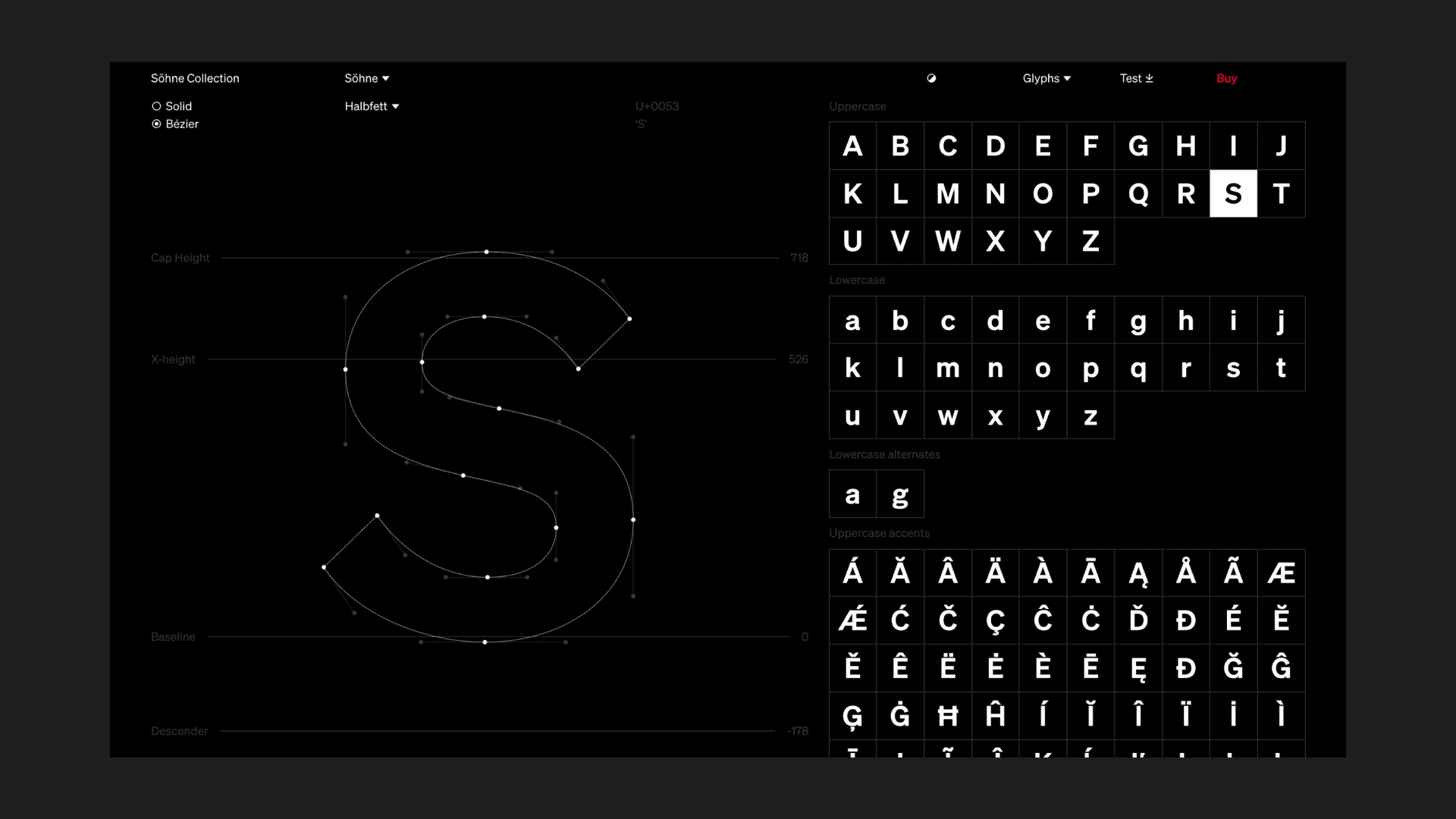
If you inspect the browser console, you’ll discover we built a small easter egg as a homage to the work of Josef Müller-Brockmann (specifically his Grid Systems in Graphic Design book) where you can see the underlying grid of the site by combining Ctrl+Alt+Shift+g on any page. Within the type specimen pages, you can toggle the page color by the icon in the navigation or by combining Ctrl+Alt+Shift+t. With both of these commands you’ll be able to recreate the book cover with a bit of experimenting.
Q: What web technologies, tools, or resources did you use to develop this?
A: The reimagined site is an ambitious marriage of speed, functionality and elegance. Under the hood there is a statically-generated Gatsby Web App front-end and a GraphQL API back-end. The redesign is structured around responsive and variable layouts based on classic Swiss design principles embedded in CSS grids. From our analysis we could also see that, generally, new visitors browse and returning visitors buy. These insights led us to create a custom e-commerce experience that connects with Stripe for transactions, Django for managing fonts and orders, and Wagtail for content management.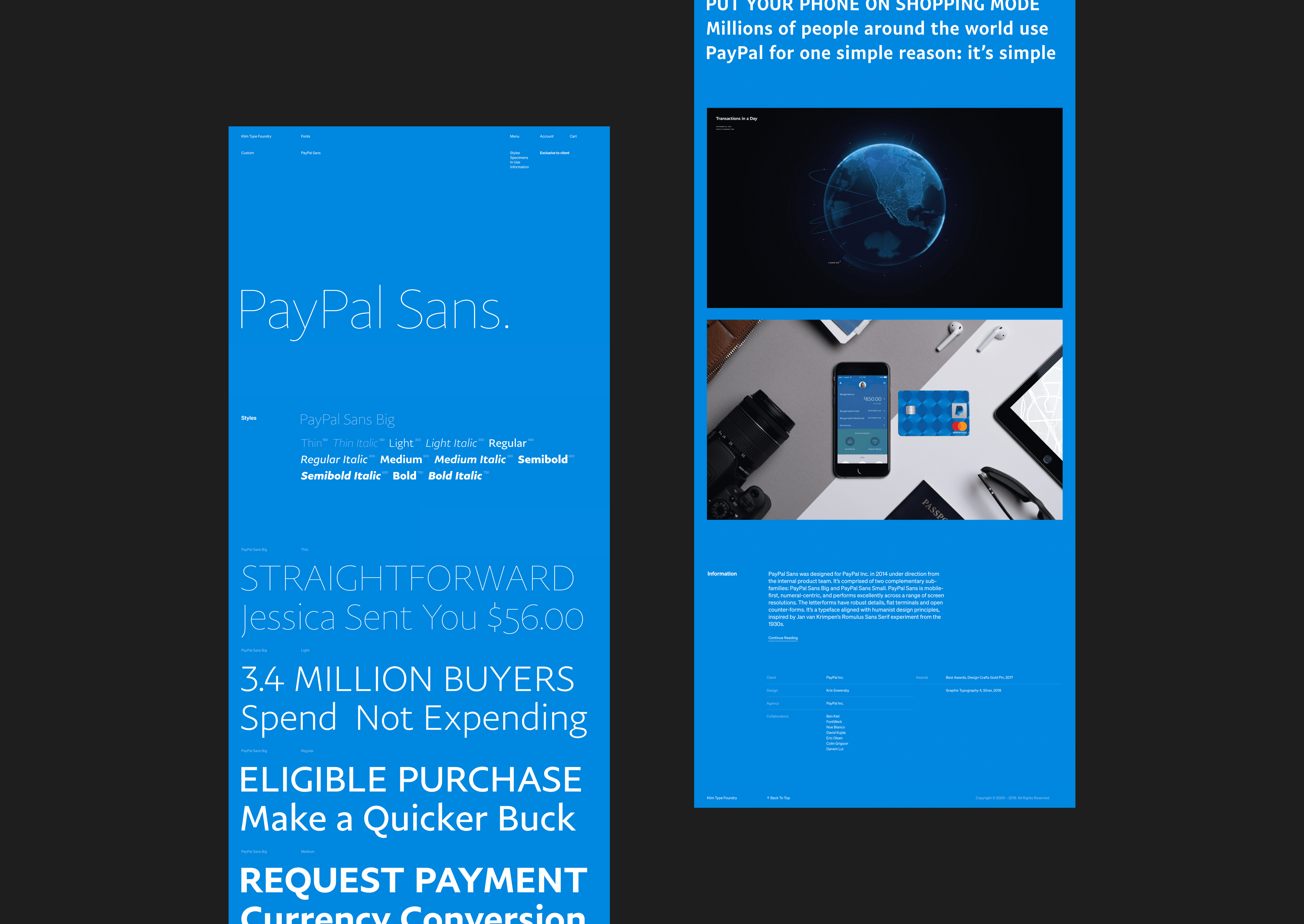
Q: What influenced your chosen technical approach, and how did it go beyond past methods?
A: The new Klim site is fully responsive, with the experience designed to work on all browser sizes. However, an interesting trend in their analytics (and across the type industry validated by user research) is that the majority of users and purchases are on large desktop displays. The redesign of the site was able to maximize large displays and full-width views. On other projects it’s more common to have a larger mobile audience and need for the user experience to be focused on smaller device viewports.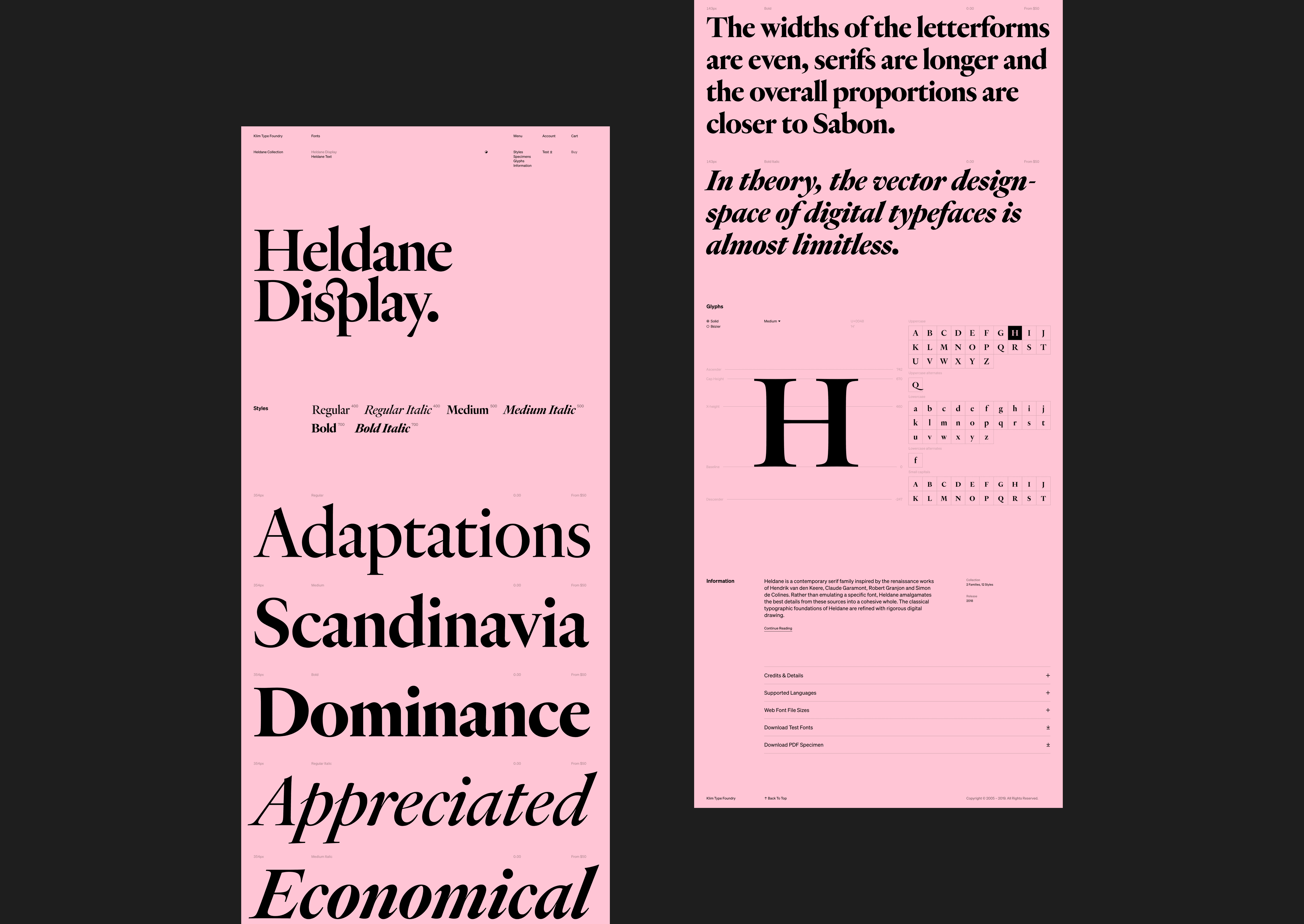
Q: How did you balance your creative and technical capabilities with the client’s brand?
A: “Our objectives were really quite simple,” says Kris Sowersby, Klim’s Director. “We wanted visitors and customers to play with our type, test it, and read about it. We wanted the experience to be effortless, informative and interesting, and for buyers to encounter a straight-forward and direct purchasing and licensing process. Aesthetically, we wanted the redesign of the site to complement Söhne, which is our new brand font."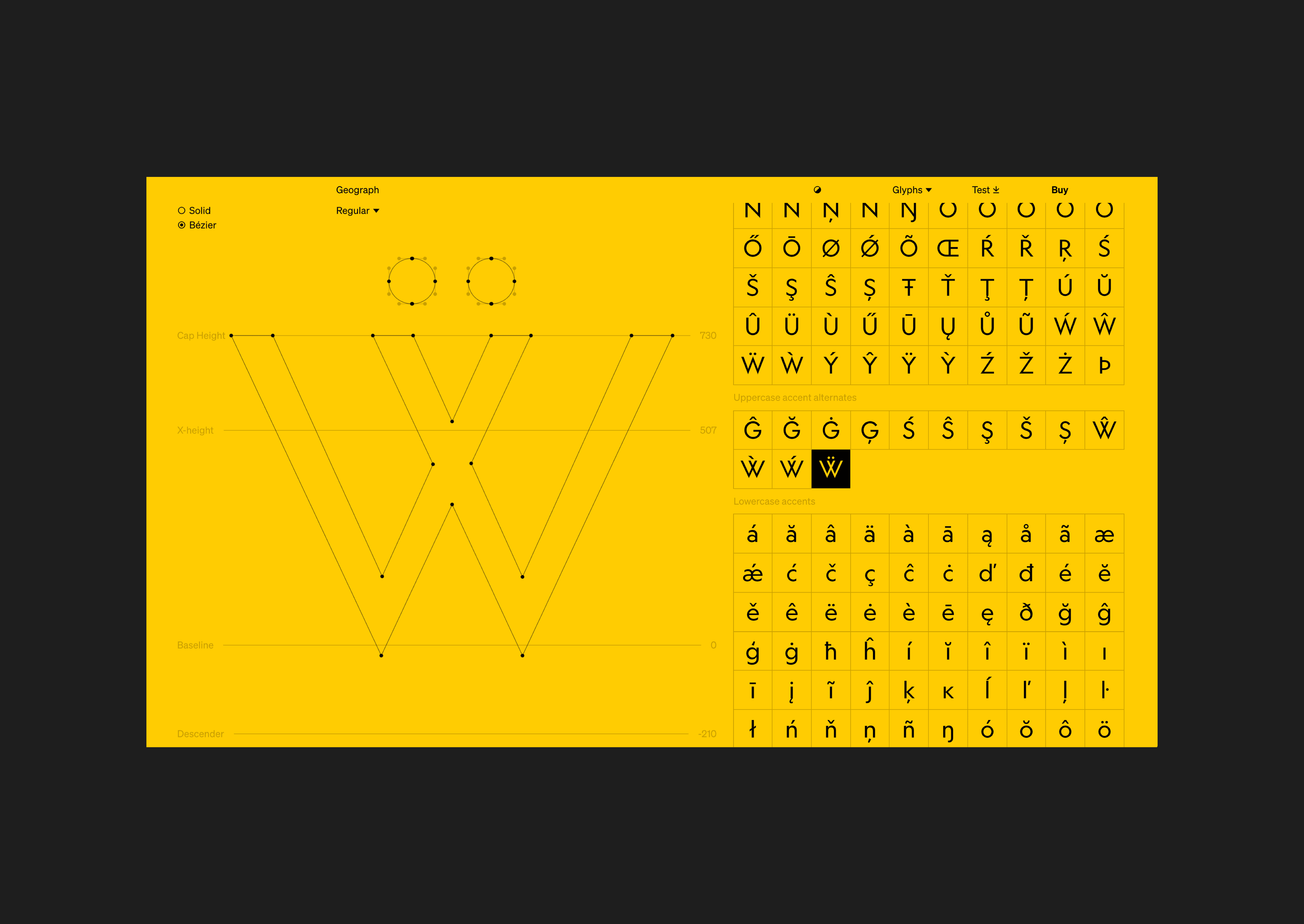
Q: How did the final product defy your expectations?
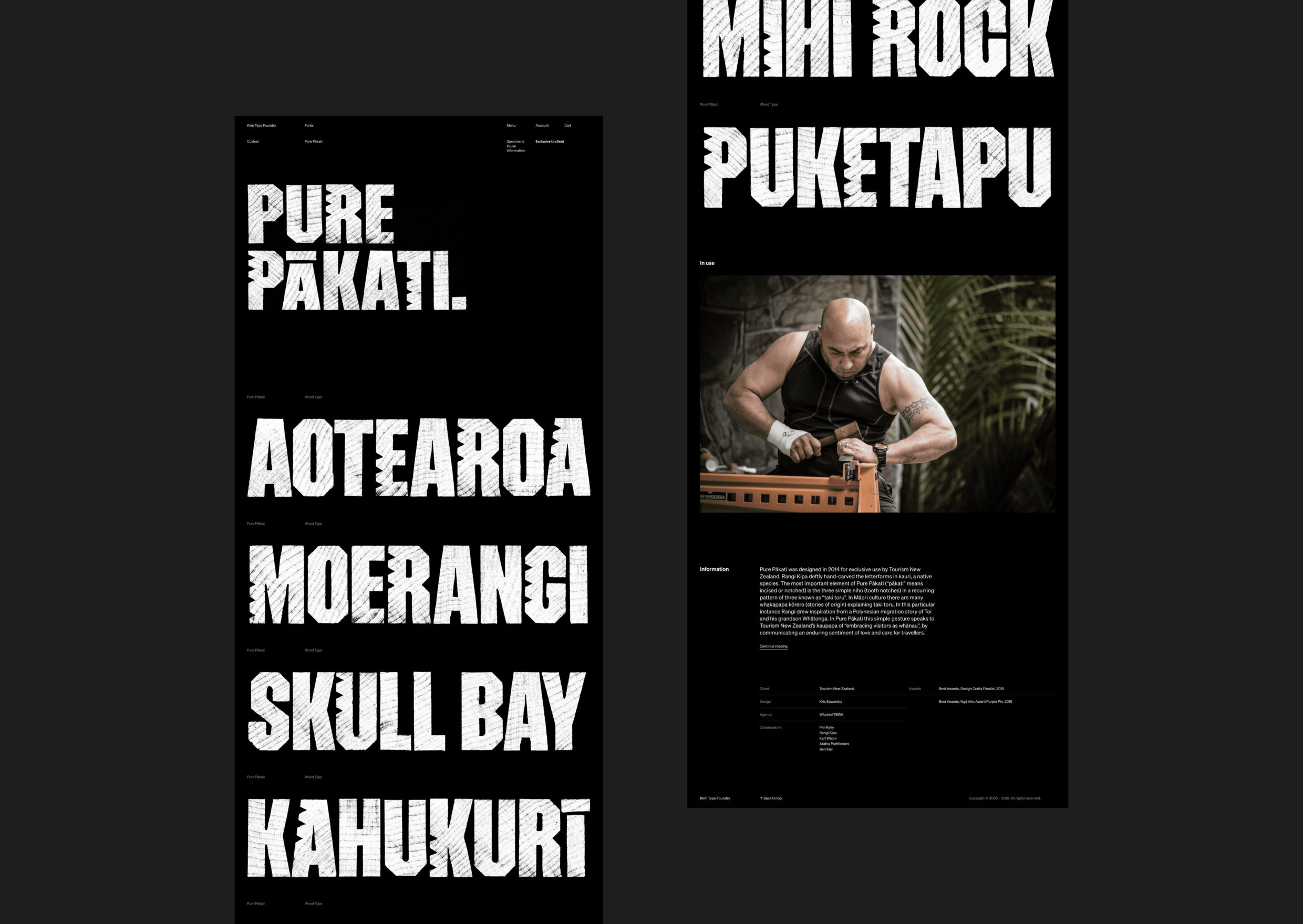
A: This site better showcases the breadth of Klim’s work in type design, but also the foundry’s gallery exhibitions and typeface identity work–the collaborations, publications, goods, colors, photography, animations, and videos that have been employed to take type to wider audiences. After much hard work, it has been humbling to see the response and feedback from the design community. "The Söhne type specimen from @klimtypefoundry is a delight. A masterclass in considered interaction design, usefulness, and inspiration.” — Mark Boulton https://twitter.com/markboulton/status/1199065671025475584?s=20