Edelman
See My Skin
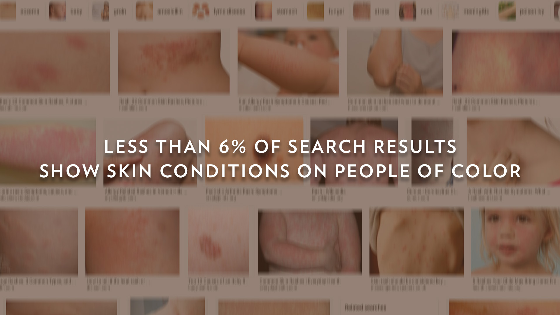
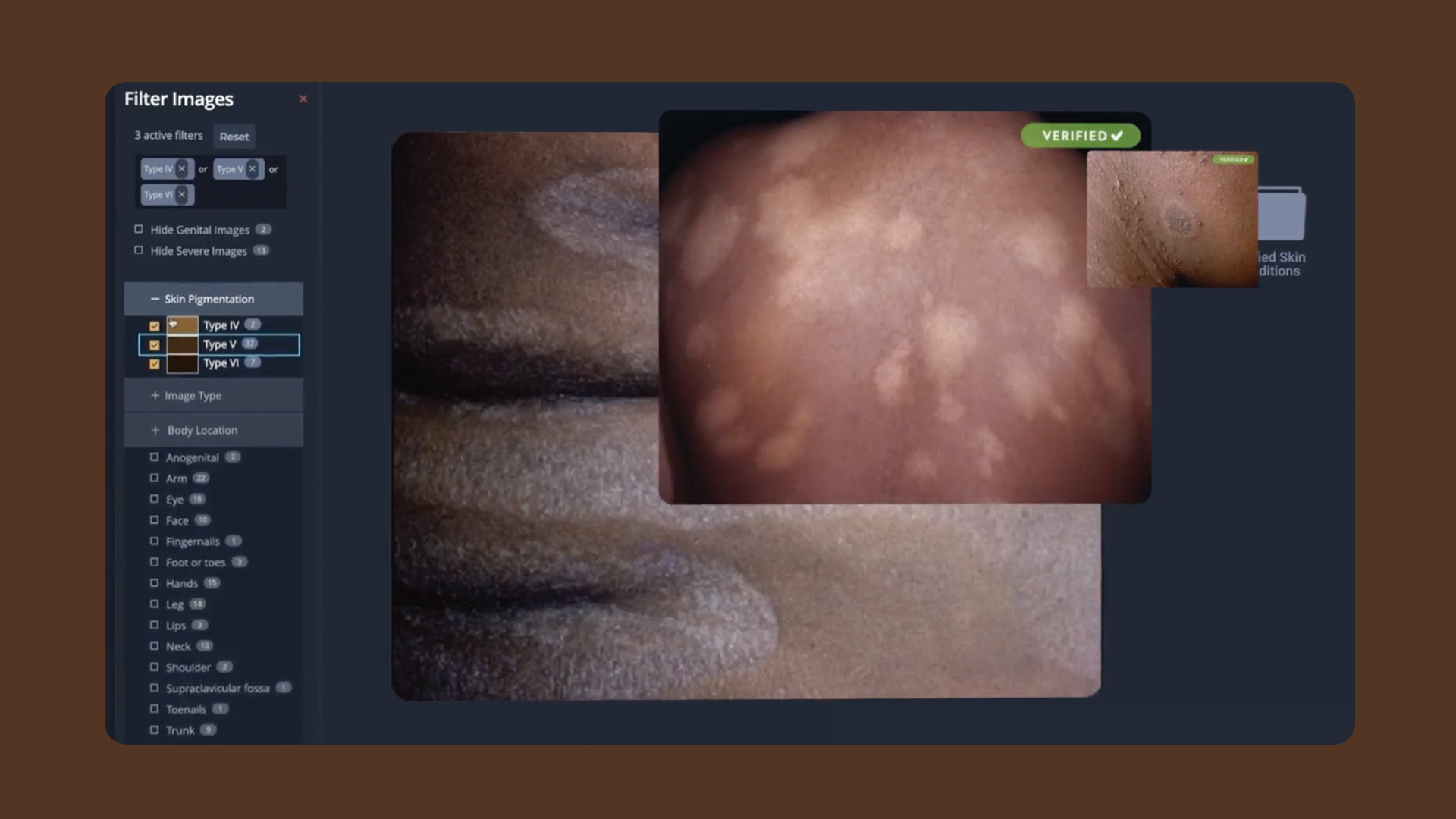
Most diverse medical image library
See My Skin
Most diverse medical image library
Public Service & Activism - Branded Content /
Webby Winner
We aggregated thousands of images to build the world’s most diverse medical image library.Melle Hock, U.S. Chief Strategy Officer
Edelman
Q: Once you settled on your idea, what influenced your decision on the chosen technical approach? How did it differ or go beyond approaches you’ve taken in the past?
A: The problem defined our approach: help people of color feel seen and to empower them to be seen. Vaseline discovered that skin health inequity starts with Google, arguably the most critical touchpoint for diagnosis. But because we couldn’t change the default white algorithm, we needed to challenge it by creating a first-of-its-kind platform that enabled people of color to see only themselves in results – something no search engine has done before.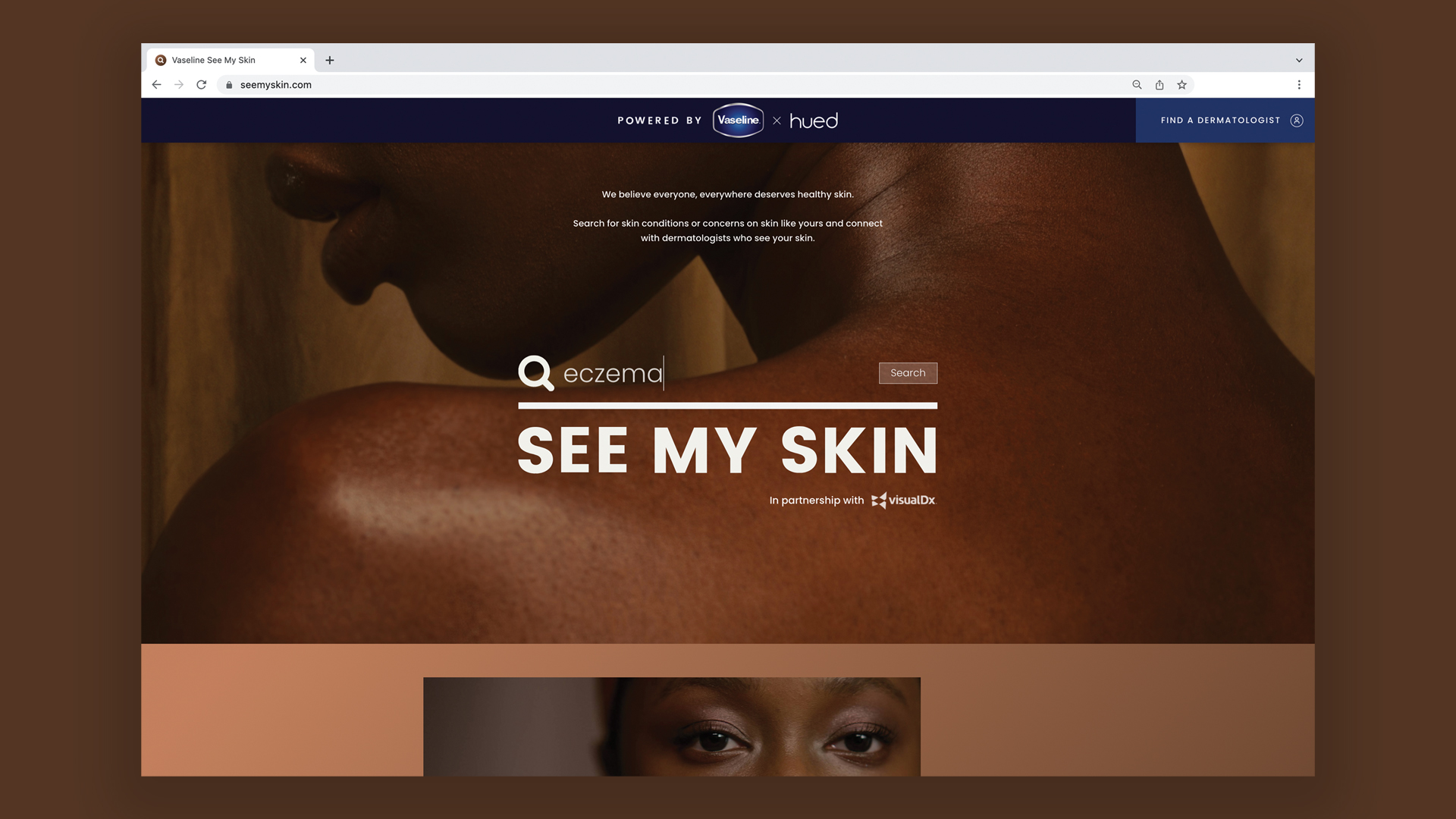
Q: What were some of your biggest learning and takeaways from this project?
A: This project was three years in the making. It’s a result of a true expert collaboration between many individuals across various specialties and departments. One of the biggest takeaways was assembling a team with vested interest who wanted to make a difference. Passion and persistence were mandatory. Most importantly, the ambition of every team member needed to match the ambition of the project.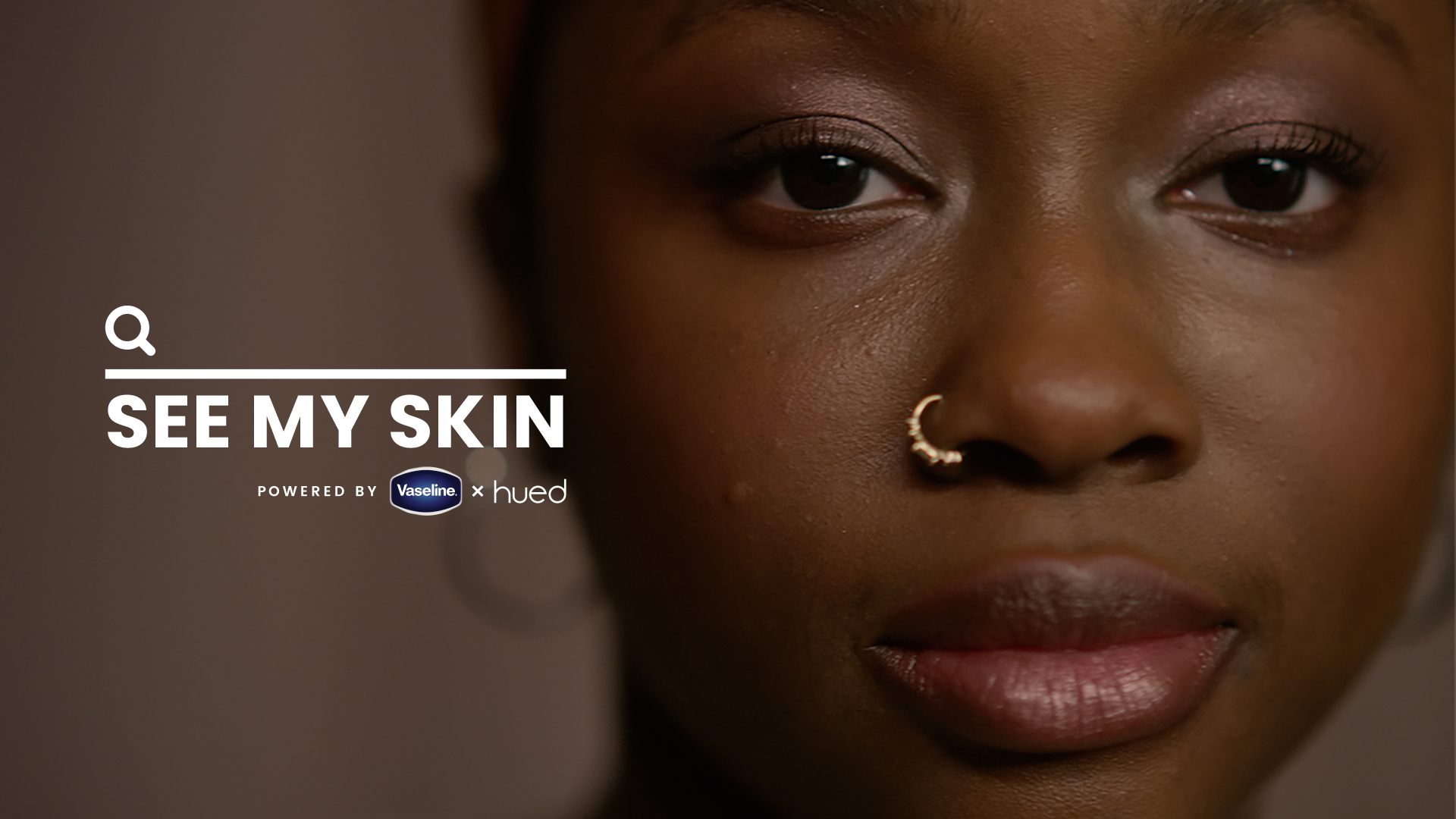
Q: What web technologies, approaches, tools, or resources did you use to develop this experience (WordPress, headless, AI, Sublime Text, HTML5, Adobe XD, etc)?
A: The site was built using Rails and JavaScript, allowing for a stable, but dynamic platform that enabled our team to make powerful custom integrations with the VisualDx API. Hosting on Heroku allowed for easy scalability and optimization. We developed the platform over the course of 6 sprints with an agile methodology. This meant our team could work closely with Vaseline and other partners to refine major pieces of functionality in-stream.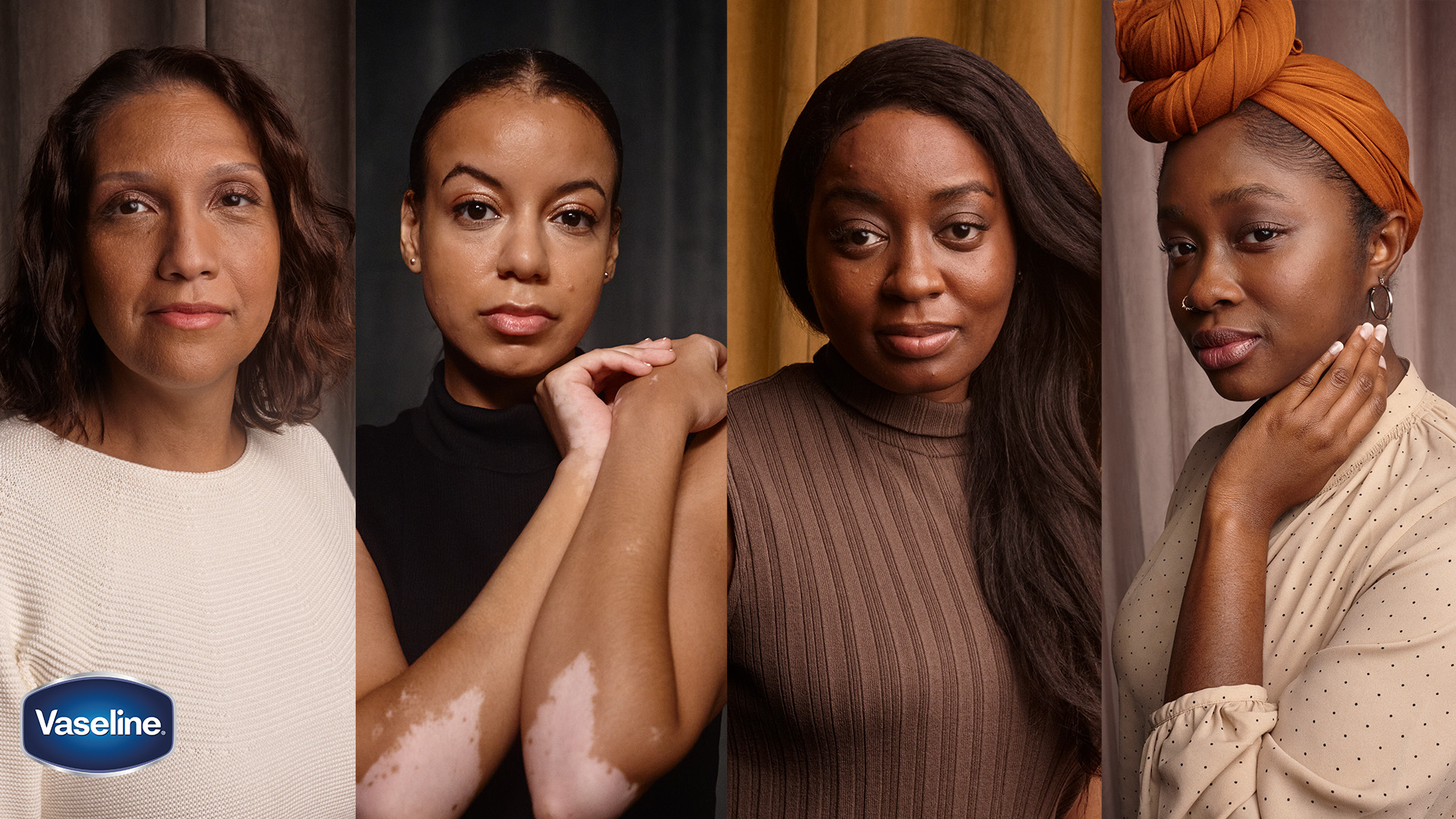
Q: How did the final product meet or exceed your expectations? What results did you see?
A: Vaseline completely reinvented the patient journey. 48% of those who searched on the site were empowered to advocate for themselves and take action, representing an increase of 1,430% in people seeking dermatological care. It’s more than a cultural statement. It’s more than a user experience improvement. It’s a built-to-last lifeline for marginalized people struggling to identify potentially life-threatening conditions.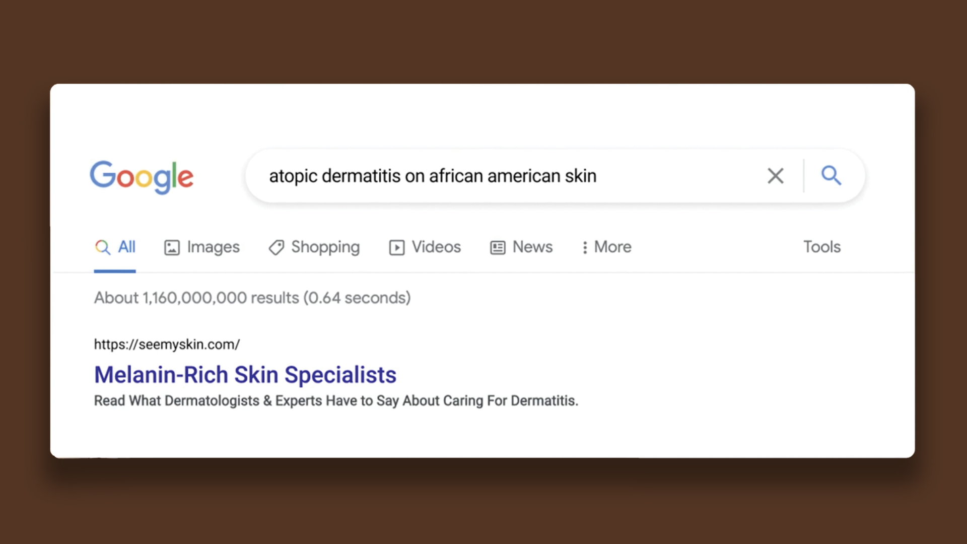
Q: Why is this an exciting time to create new digital experiences? How does your team fit into this?
A: Despite advancements, people of color are still struggling to reconcile their growing numbers and influence with outdated systems – dermatology and technology – that were never designed with them in mind. But now, more than ever, what we create in the digital world has the power to create systemic change in the real world. Our team, composed of diverse individuals, believes that digital solutions can push society towards a more equitable future.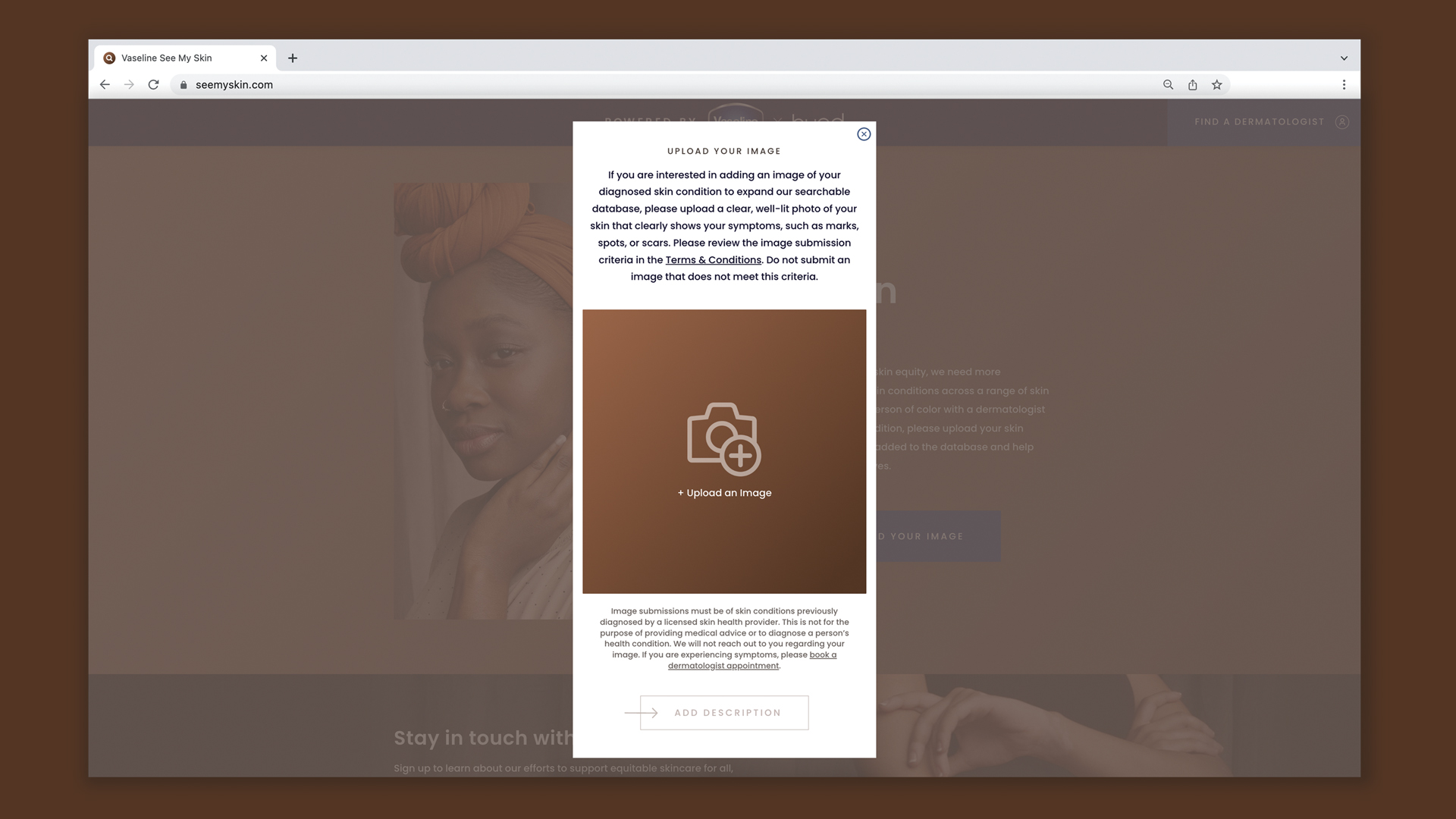
Q: How did you reach a good balance of your own creative ideas and technical capabilities with a fair representation of the client’s brand?
A: The creative idea behind See My Skin was always in service of greater skin health equity for people of color, which naturally aligned with Vaseline’s brand purpose of Equitable Skin Care For All. While there weren’t any technical limitations to the platform build itself, we needed to maintain the intent and integrity of the idea throughout the development process. That meant, ensuring all parties were in lock step at all times.