GSD&M
Space Force Dot Com
Spaceforce.com - Turning skeptics into believers
Space Force Dot Com
Spaceforce.com - Turning skeptics into believers
Features & Design - Best Use of Animation or Motion Graphics /
Nominee
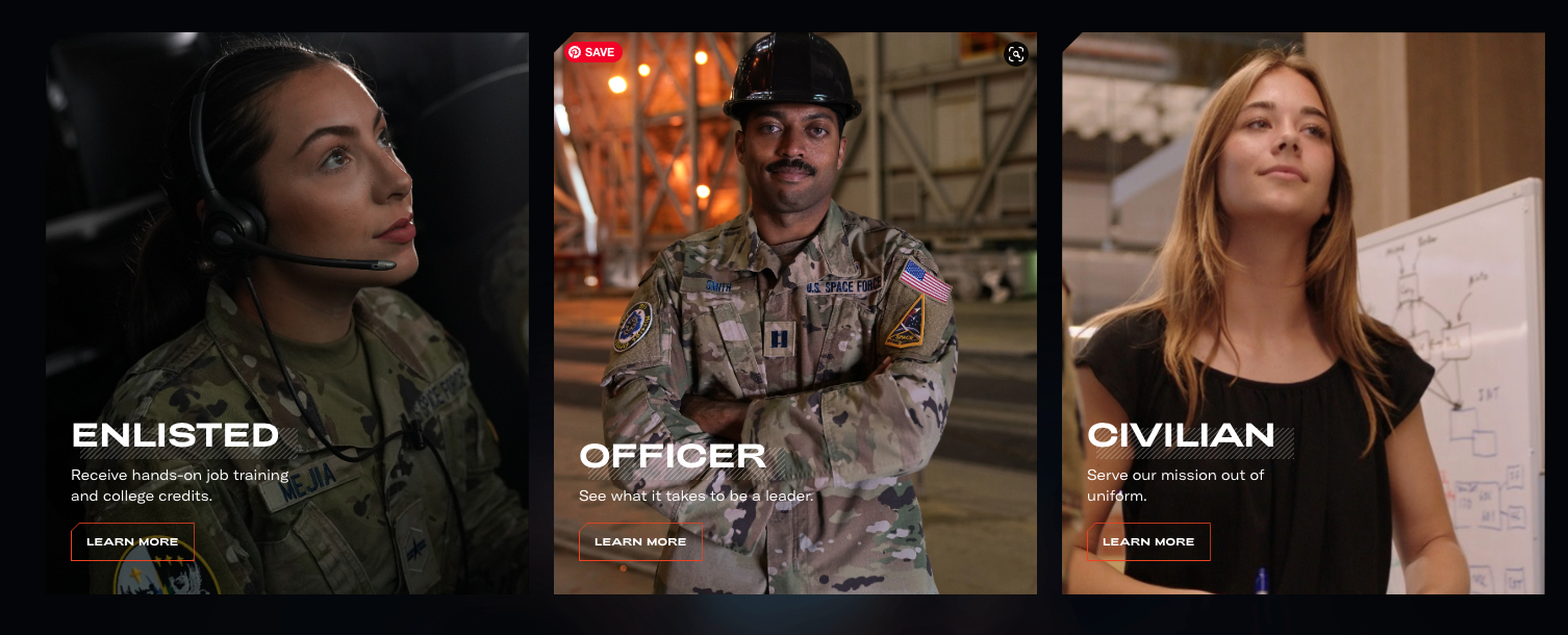
Demystify the Space Force and inspire the next generation about potential space careers.Jessica Wicks , Director of Creative/Production Operations
Q: Once you settled on your idea, what influenced your decision on the chosen technical approach? How did it differ or go beyond approaches you’ve taken in the past?
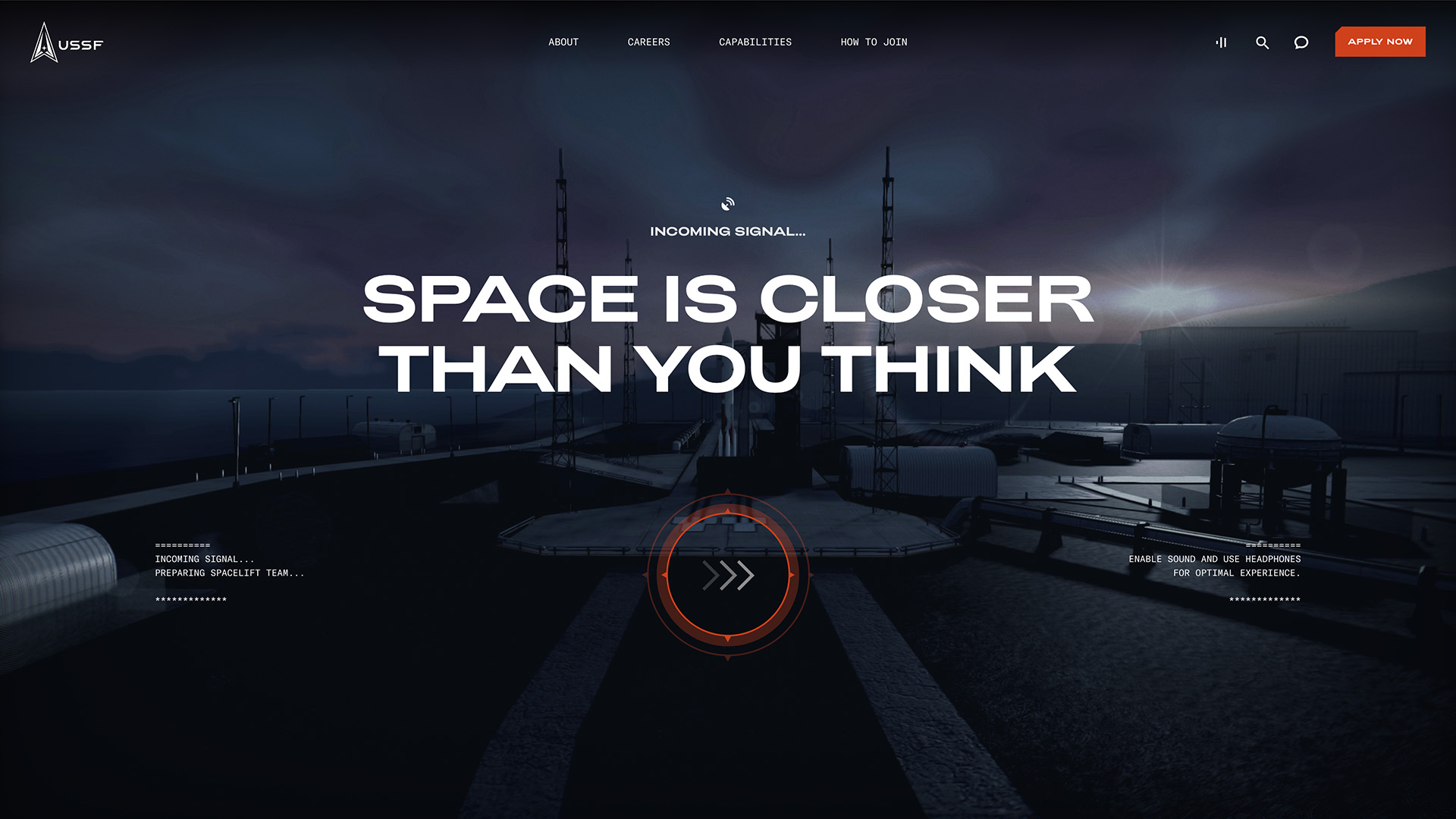
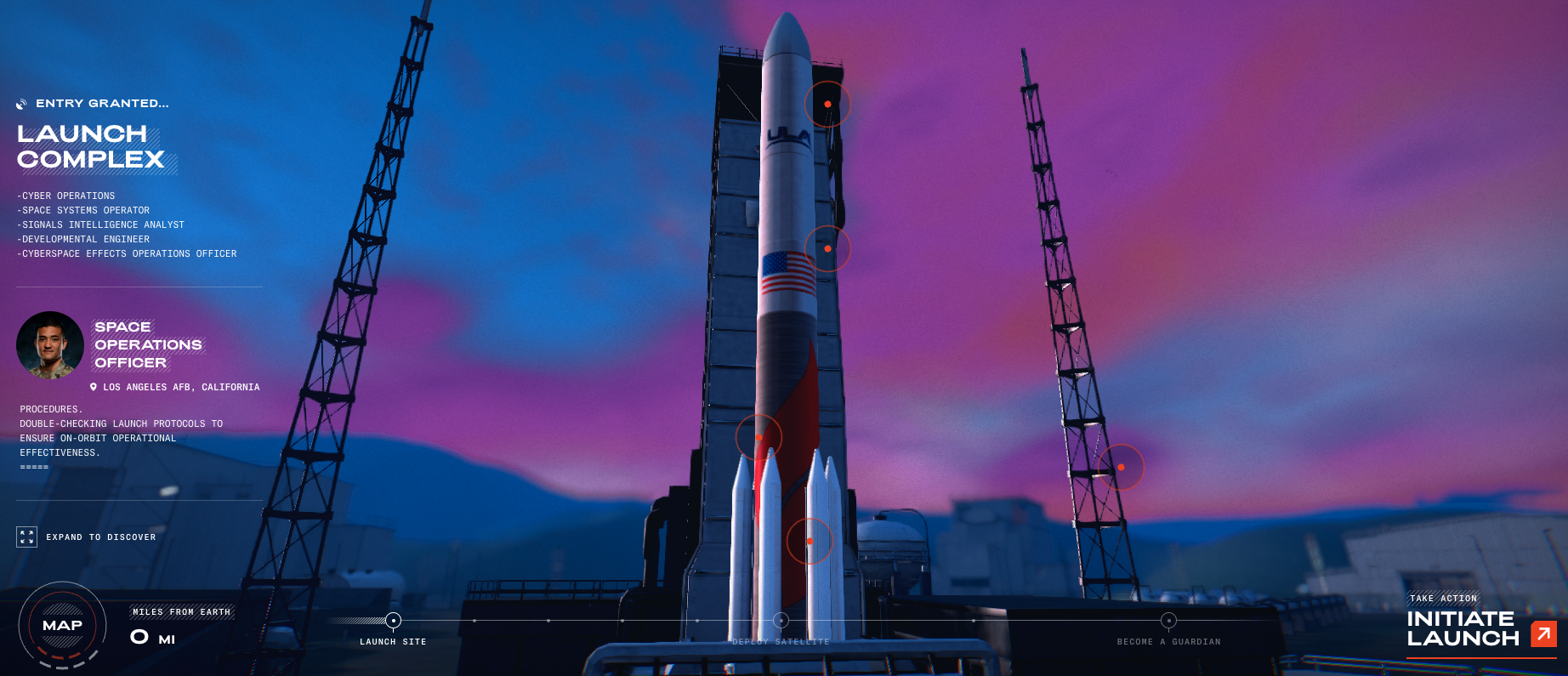
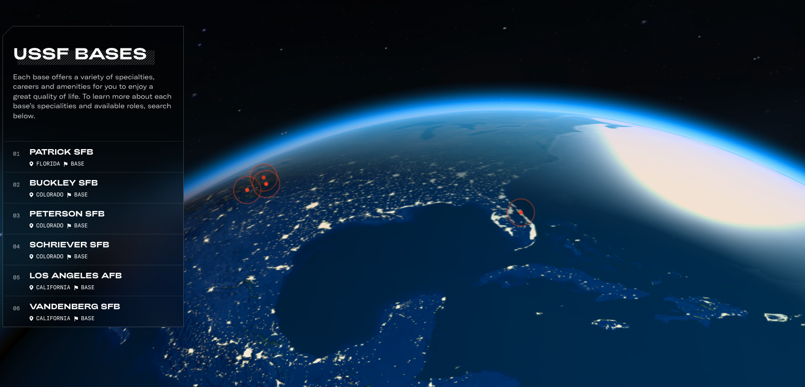
A: We needed to balance rich interactive visuals with content-dense recruitment information. With thousands of daily visitors, the site needed to load fast, be flexible enough for ongoing updates through a CMS-driven back end and also be awe-inspiring and forward-thinking. We focused on a few big moments to be featured as 3D models and let those shine while using subtle animation and optimized graphics elsewhere.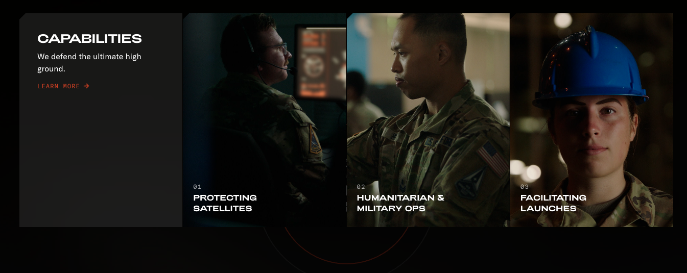
Q: What were some of your biggest learning and takeaways from this project?
A: We picked some really ambitious moments to render 3D into a browser, highlighting a rocket launch and showing a payload deployment that involved a lot of moving parts. We really had to balance all of the lighting, detailed pieces on the rocket and scale of it all to ensure it looked realistic.
Q: What web technologies, approaches, tools, or resources did you use to develop this experience (WordPress, headless, AI, Sublime Text, HTML5, Adobe XD, etc)?
A: The web experience used Next.js, Three.js and Theatre.js for 3D animations; Framer for DOM animations; Contentful for content management; and Figma for design. We also developed custom tools for in-browser development, extending Theatre.js with extra features. The result was a visually stunning and interactive website that engaged users.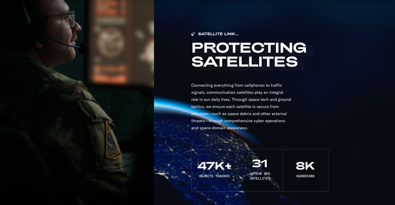
Q: How did the final product meet or exceed your expectations? What results did you see?
A: Our promising results compare the old SpaceForce.com from December 2022 to the new site post-launch. In its first month, 52.4% of the FAQ interactions were recruiting-centric. Total sessions were up 15% month over month, with over 90% coming from mobile devices, where our potential recruits prefer to play. These positively trending results make us confident the new site is working as both an information hub and a hardworking recruiting website.
Q: Why is this an exciting time to create new digital experiences? How does your team fit into this?
A: The world of web-based graphics and hardware improvements have made it possible to create dynamic graphics that work across modern and even older browsers. This site wouldn’t have been technically possible even a few years ago, so it’s a really exciting time to be exploring this space. We also anticipate (and early results have shown) that the majority of our users are mobile. Our tech stack ensures no sacrifices on mobile.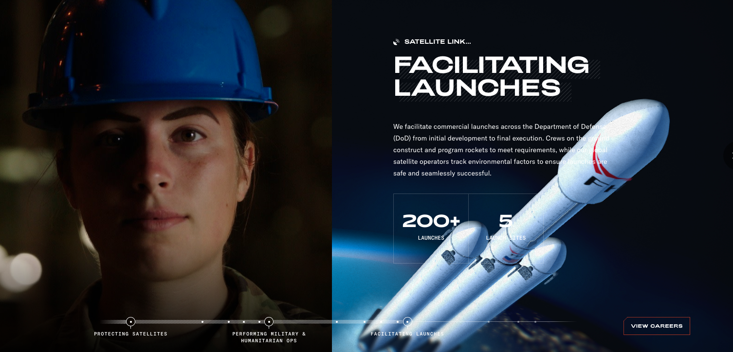
Q: How did you reach a good balance of your own creative ideas and technical capabilities with a fair representation of the client’s brand?
A: This was one of the more interesting challenges. It's important to represent the Space Force as grounded and realistic as possible because they are solving the problems of today. We also wanted to make sure they are represented as digital-first and forward-thinking, and keep our concepts technically possible without impossibly long load times. By limiting the amount of 3D assets and making smart animation choices, we found balance.