The Web Kitchen
Wellington College
Energetic, animated, impactful, unexpected and inventive!
Wellington College
Energetic, animated, impactful, unexpected and inventive!
School/University /
Webby Winner
Building a technically complex website whilst maintaining a clean and energetic visual identity.Matt Handley, Creative Director
Q: Once you settled on your idea, what influenced your decision on the chosen technical approach? How did it differ or go beyond approaches you’ve taken in the past?
A: We knew from the copywriting work we had done that we had a strong brand narrative to showcase on the homepage. We also co-produced a series of short films and a powerful introduction film. These assets, combined with the punchy new brand, formed the foundations of the homepage. We pushed the functionality of the page to a new level by combining scroll-based parallax animations with horizontal scrolling sections to create a unique experience.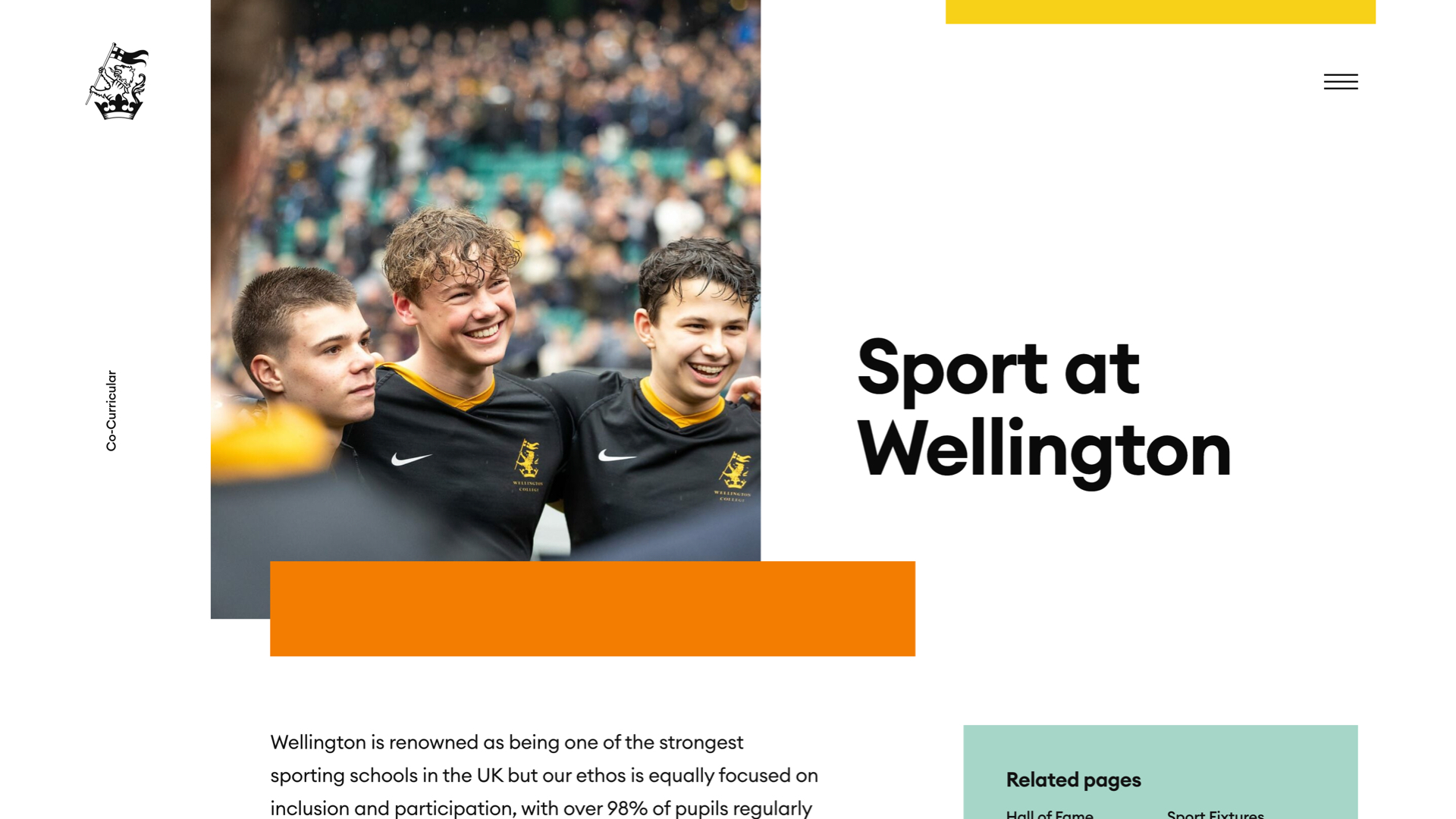
Q: What were some of your biggest learning and takeaways from this project?
A: Combining fixed background text elements with multi-directional scrolling forced us to think outside of the usual boundaries of how a webpage is built. As developers, viewing the webpage more like an artboard with multiple layers was crucial as it enabled us to achieve the seamless experience we wanted. Using clip-paths and GSAP for a full page journey also taught us a lot about edge cases and browser limitations to consider in future projects.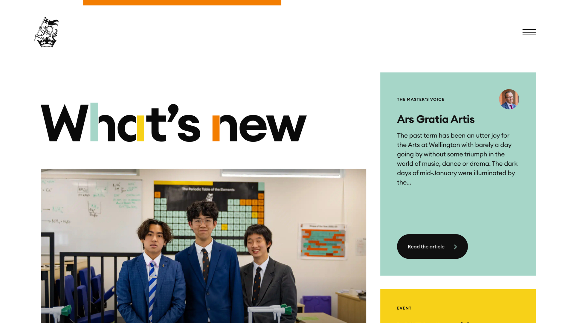
Q: What web technologies, approaches, tools, or resources did you use to develop this experience (WordPress, headless, AI, Sublime Text, HTML5, Adobe XD, etc)?
A: We use Sketch for the UI/UX design and After Effects to prototype animations. AE was also used to create the introduction video. We built the site on WordPress with a bespoke theme that uses PHP, HTML, and JS (using GSAP library for the animations). The GreenSock animation library enabled us to develop a prototype quickly, allowing us to fine tune the animation timings and easings with designers and developers working side-by-side.
Q: How did the final product meet or exceed your expectations? What results did you see?
A: When trying to create something you’ve never attempted before there’s always a slight sense of trepidation alongside the excitement! We were delighted to hear lots of positive feedback from users about how engaging they found the homepage and the rest of the journey through the site. Early on in the branding process we envisage how the visual identity will work on the website so seeing it all come to life and tie together so well was a pleasure.
Q: Why is this an exciting time to create new digital experiences? How does your team fit into this?
A: The web is constantly evolving, giving us better tools to create exciting digital experiences. Our team takes full advantage of this and looks to push the limits of what’s possible at every opportunity. Browser support is rarely a limiting factor these days which means innovative ideas really can become a reality. The base level of what our clients expect is also much higher than it ever was which is a challenge we enjoy.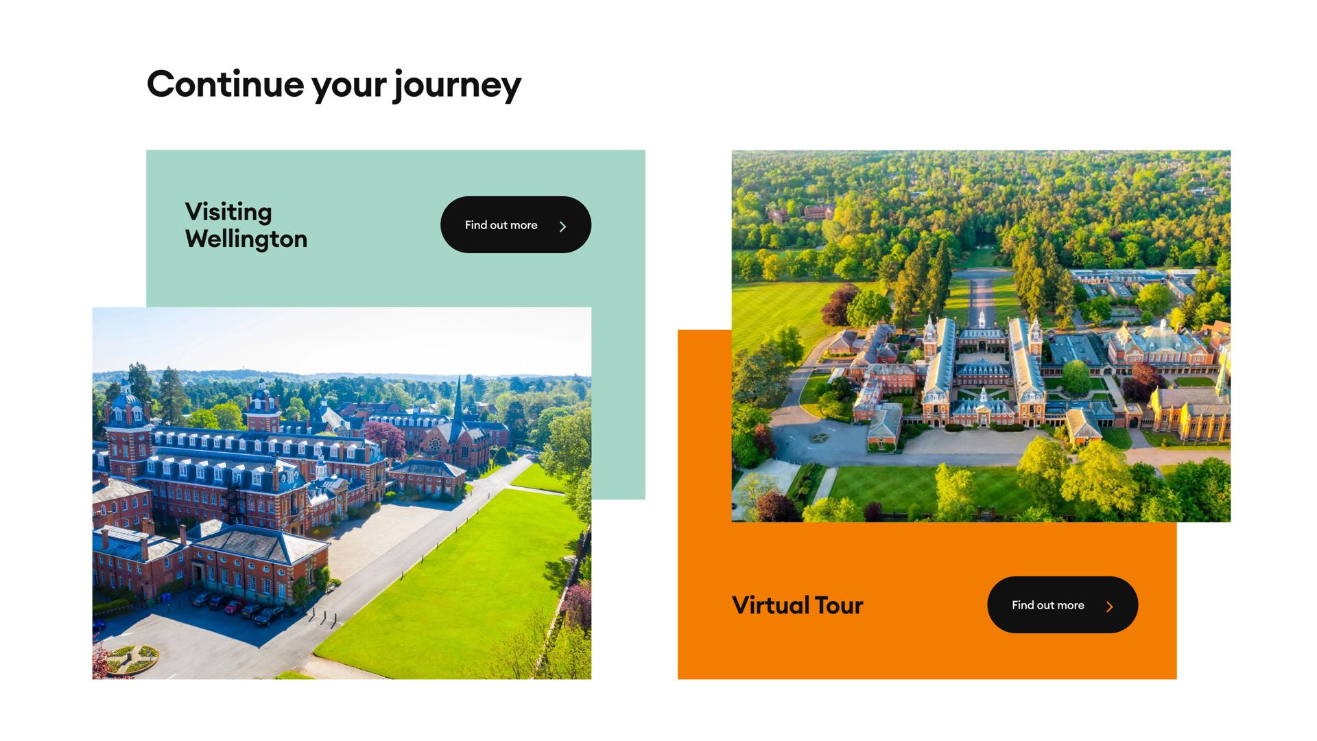
Q: How did you reach a good balance of your own creative ideas and technical capabilities with a fair representation of the client’s brand?
A: We feel there is a huge benefit to the client in our team creating both the brand and the website alongside one another. We can think ahead to how the brand will visually apply to the website, but also to how we can tailor the functionality and animations to tie in with the new brand. For this project, we had a lot of input into copywriting and asset creation too, so we really were in an ideal position to make the project as cohesive as possible.